Straight to the Point
Background
As part of a UI/UX program through CalArts, I was asked to invent a restaurant and create a website for them. The only restriction was that the restaurant must offer local delivery and order customization.
My concept was a restaurant that would take an American classic, the ice cream sandwich, and elevate it with premium quality ice creams and fresh baked cookies in a mouthwatering variety of flavor combinations.
Plan
Design Crumb and Cream a website that has:
- All the basic information someone would need about the store like where it is located, when it is open, and how to contact for more information.
- A way to order food for delivery that can handle any combination of just cookies, just ice cream, recommended ice cream sandwiches, and a la carte custom ice cream sandwiches.
- Enough food imagery to get the mouth watering, using the store’s own products as the source.
- A design language that represents the store’s upmarket brand, using colors and fonts evocative of the mid-century modern design to capture that illusive intersection of classy and cool.
Results
A clickable prototype was developed, with a mostly complete feature set. In addition to the beautiful front page, you can select food to order, including customizing an ice cream sandwich by cookie and filling; walk through each step of the ordering process; and go to the Visit page to learn more about the restaurant. You can try it yourself here:
All The Nuts and Bolts
Audience
I set Crumb and Cream’s fictitious location to be in Palo Alto, CA, an affluent neighborhood with easy access to the Stanford college campus, Silicon Valley tech employees, and more. The main target would be Palo Alto’s local population, which demographically trends towards:
- College educated.
- Married.
- Suburbanite.
- Income and/or wealth well above national average.
Given the restaurant’s emphasis on high quality ingredients, and therefore an upscale and more expensive version of the ice cream sandwich, it seemed natural to position the restaurant as more of a luxury experience to match the desires of the wealthier clientele of the surrounding area.
User Needs
People coming to the website will be potential patrons who will want a bunch of basic questions answered: Is the restaurant open? Will it deliver to my address? Where is the restaurant’s physical store front and is it near me? What kind of cookies, ice cream, and combinations are available to order? Are there special/seasonal flavors available right now? How much will orders of various sizes cost? How do I make/place an order? How long will an order take to arrive at my location?
Client Needs
The owners of the restaurant have a more complex set of needs, from purely pragmatic to business oriented.
On the purely pragmatic side of things, the website obviously needs to provide a system for selling food, with a subsystem for customizing an order, including multiple custom purchases in a single order.
On the business oriented side of things, the website needs to drive sales, engender goodwill with customers to foster repeat visits/usage, not be overly expensive or difficult to maintain, etc. While all of those factors informed my design, for this project I chose to really prioritized the branding aspect. I took special care to communicate upscale and gourmet, without sacrificing a sense of fun (this is ice cream and cookies, after all), on every page.
Visual Language
The main challenge here was coming up with some kind of unifying visual idea that could be both classy and fun. Stereotypical classy designs seemed too stuffy and failed to connect with the inner child the way an ice cream shop should, yet stereotypical fun designs, at least as far as ice cream places go, tend to be overly childlike and completely wrong for Crumb and Cream’s more expensive and luxurious experience. Initially, it seemed impossible to find a cross-over point between the two.
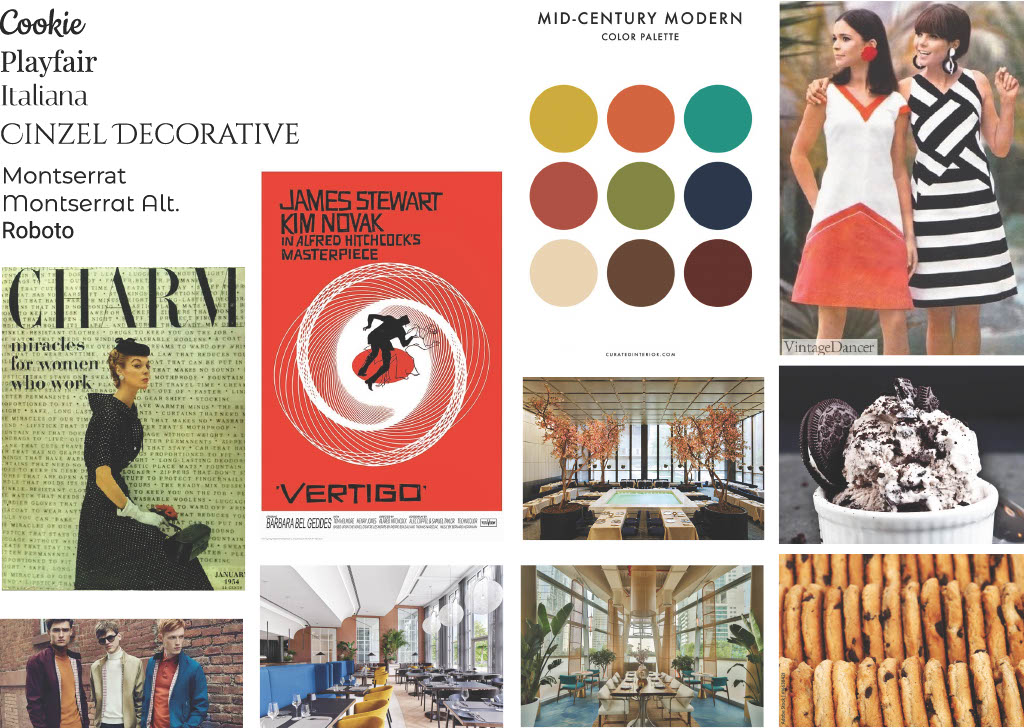
While looking for an anchoring idea, I came across a font that was evocative of the legendary graphic designer Saul Bass (known for the credit sequences and/or movie posters of such classics as Psycho, Vertigo, and the original West Side Story). This had me thinking about the Mod scene and how mid-century modern aesthetics are both classy and cool. It is old enough to be canonized as a timeless classic but it’s intentional shift away from the art and design of earlier periods keeps it from feeling elegant in a pretentious or alienating way. It has an almost nostalgic vibe for Palo Alto’s rich retirees while also capturing the cool factor for millennials who went through the 60s revival period in their teens and early twenties.
With this design concept in mind, I put together a mood-board (shown below) with mid-century poster design, fashion, fonts, color palettes, and architecture, mixed with a some cookies and ice cream, to use as inspiration.
Site Map
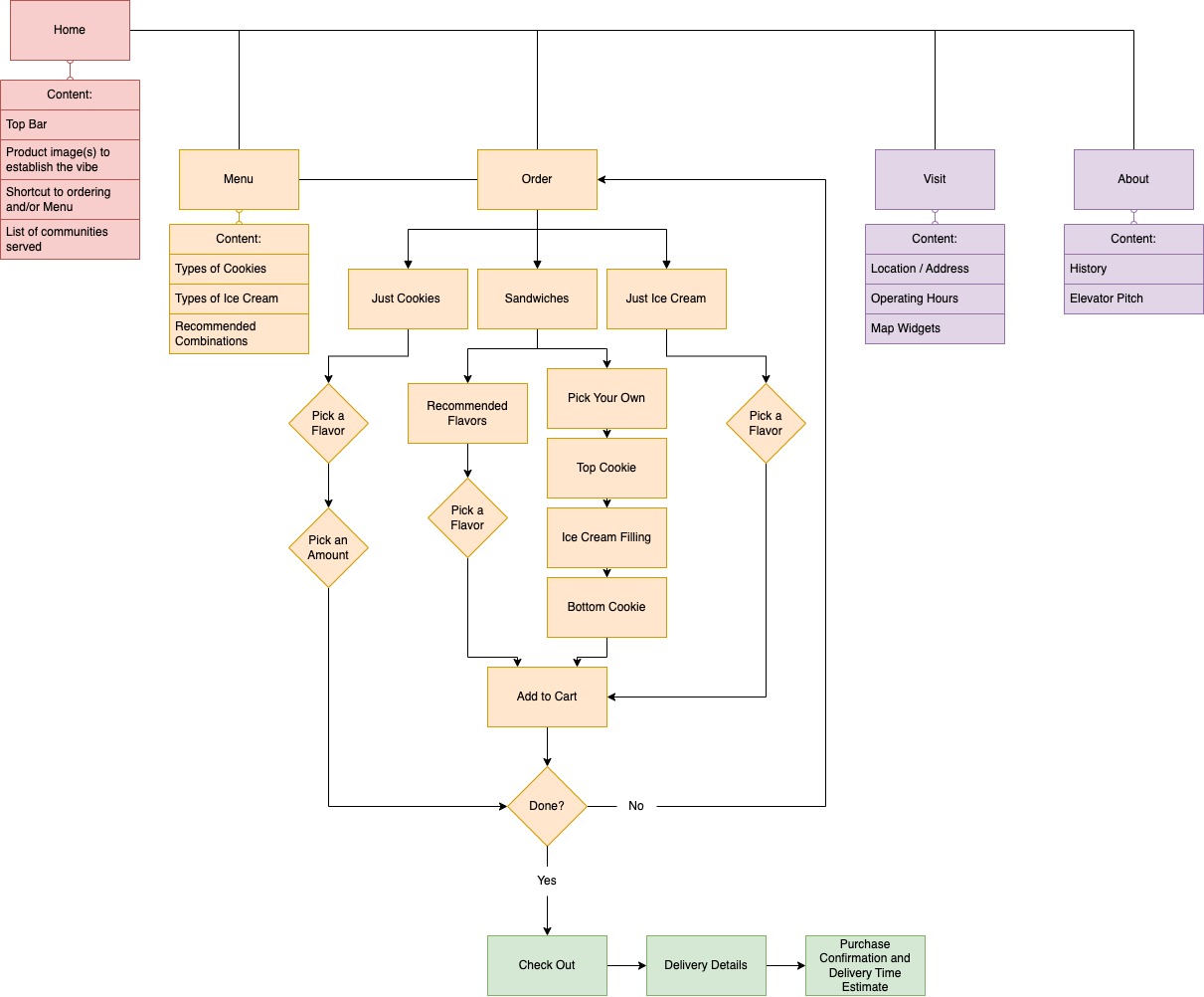
I created an outline of scope, which was essentially a repeat of the ideas of the user and client needs, and grouped concepts together by type. This created the top level pages like Home, Order, and About as well as the content on each, such as Product Images, Ordering Process, and Elevator Pitch, respectively.
It was also during this process that I nailed down the exact flow that the multi-step ordering process should take. Though expressed as a flow of choices sequentially, I knew from early on that I wanted the majority of this process to live on (functionally) a single page, for convenience, and that the customization of a sandwich should not be strictly linear and let you pick the components in any order.
Wireframes
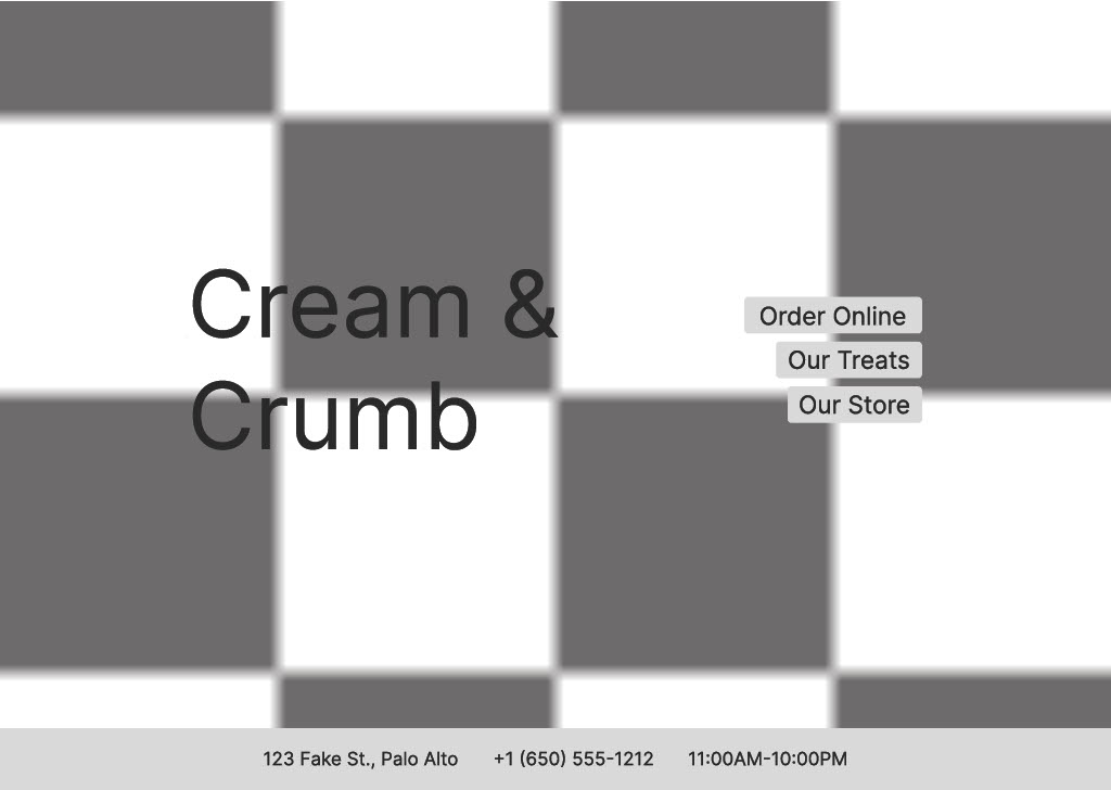
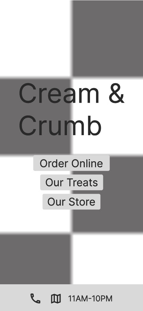
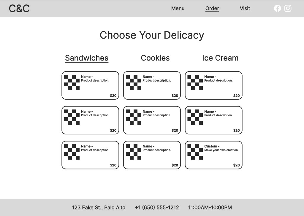
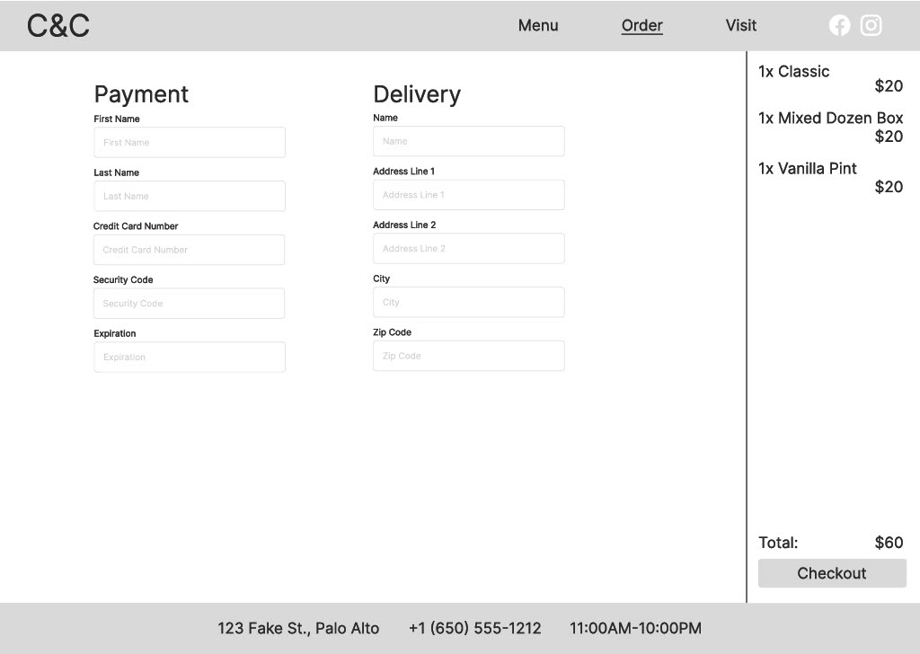
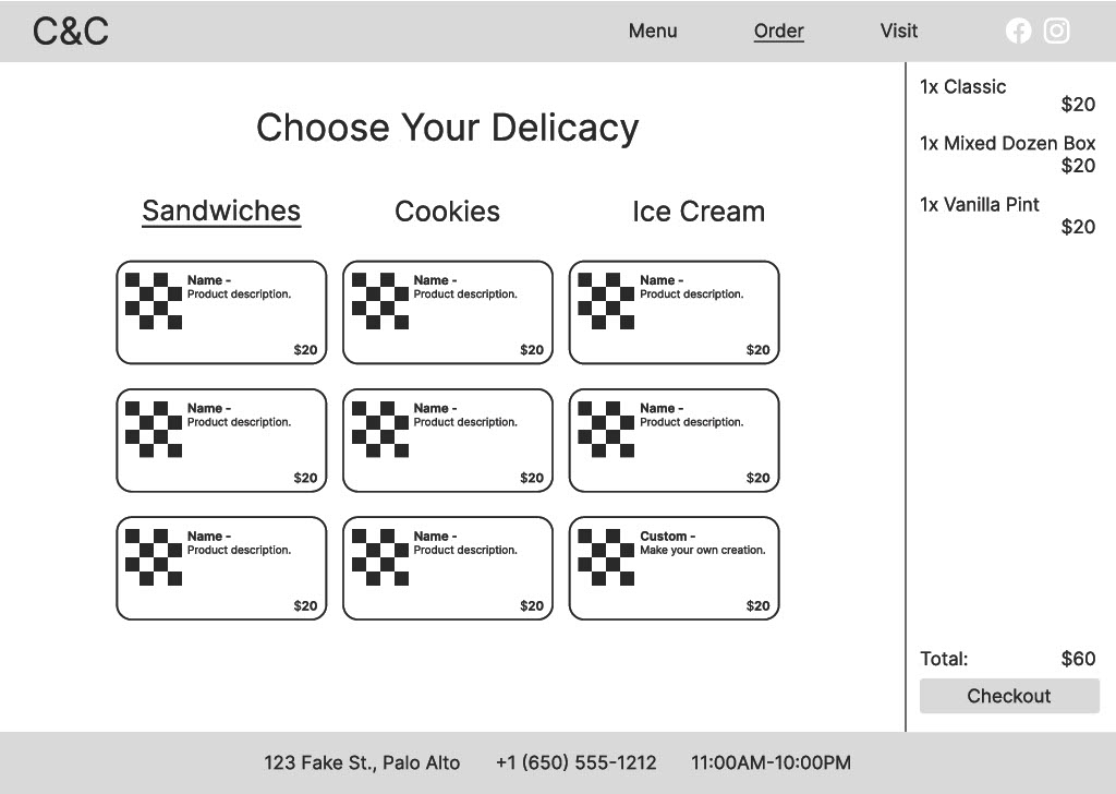
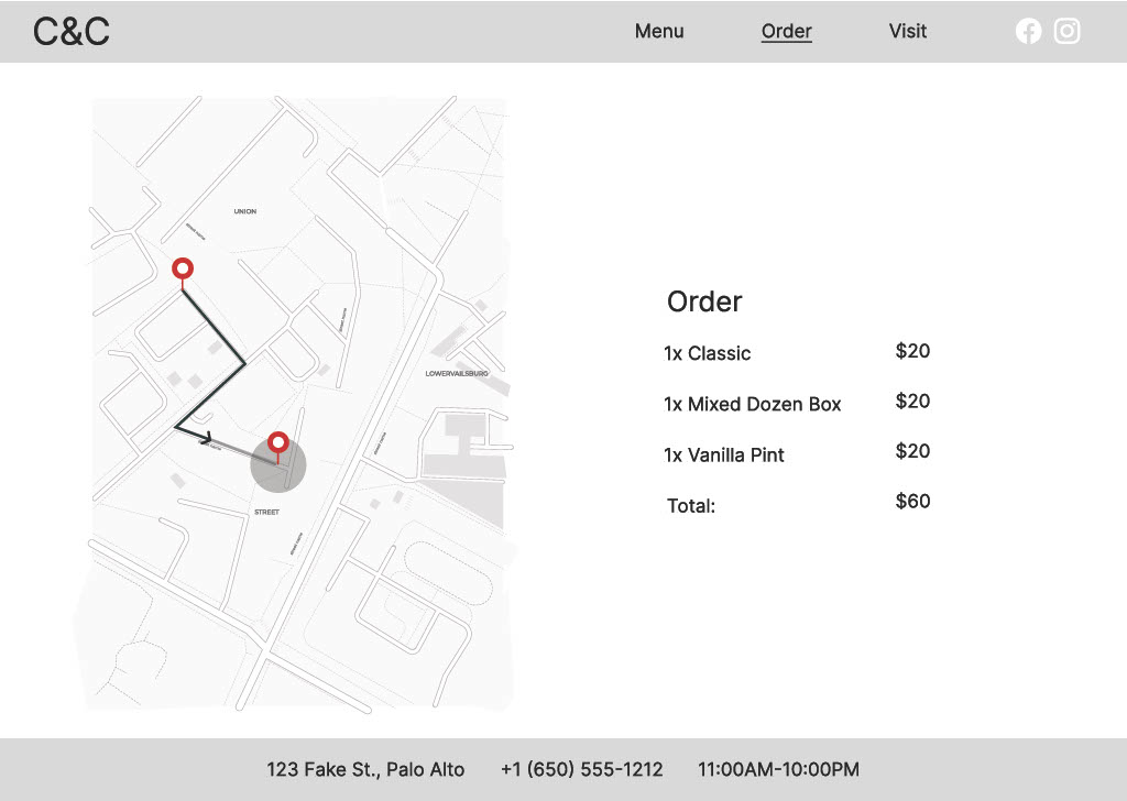
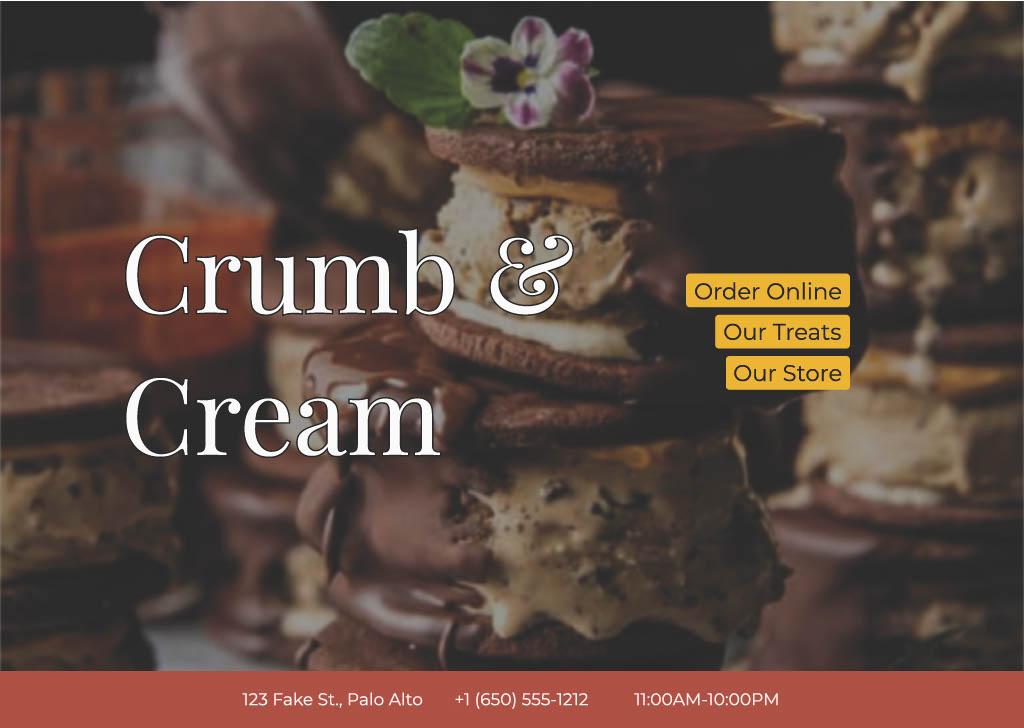
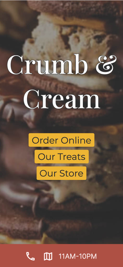
I had already begun to envision the shape of the site, its layouts and its overall look and feel, as I was developing the site map, so creating the wireframes was largely about putting that concept to the test and re-thinking the places where it didn’t turn out as well as I imagined. This resulted in some small adjustments to the organization of material. For example, the Homepage content was simplified and made more like a splash page to help put emphasis on one of the site’s best marketing features: mouthwatering image(s) of the store’s offerings. The top menu bar was dropped (from the front page) and a bottom bar was added (site-wide) to show the address, phone number, and operating hours. This consolidation of materials also meant that the Visit and About pages in my original site map were condensed down to a single page. The desktop home page, mobile home page, and a selection of pages from the ordering process are shown below.
Visual Mockups
With the upgrade from wireframes to visual mockups, I referred back to my mood-board for the final aesthetic. Ultimately, the thing I found most useful was the color palette, which informed my color choices throughout.
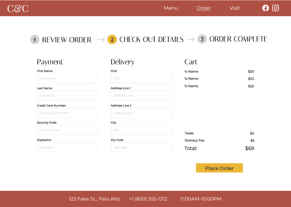
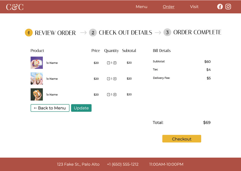
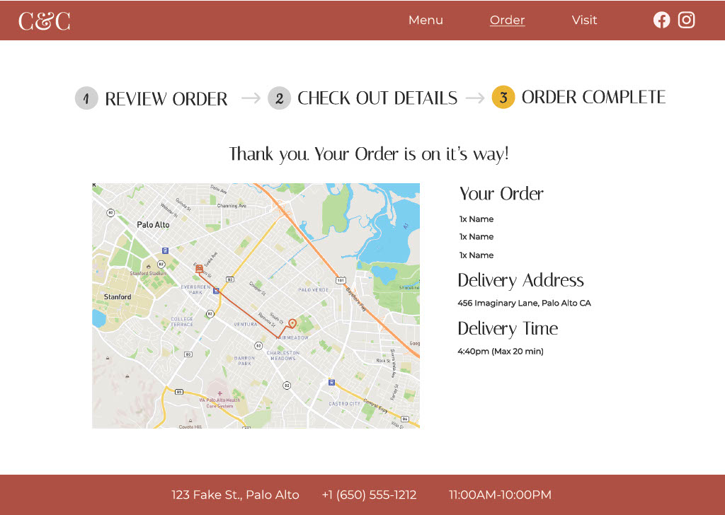
During this process, I also had the opportunity to see what other students were doing and receive feedback on my wireframes. From there, I got inspired to create a much better version of my ordering process, with better breadcrumbs and a more intuitive flow for everything that comes after you place your desired items in the cart.
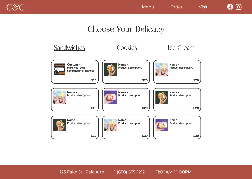
You can see how the home page came to life, and how the purchasing process evolved, in the example mock ups below.
Final Product
The final deliverable was a clickable prototype with a mostly complete feature set. The class guidelines required that the prototype include a home page, about us style page, and a food ordering process with customization. My ordering page allows for selecting sandwiches, cookies, or ice cream, with the ability to make your own flavor combination sandwich using a pop up, and can walk you through the broad strokes of the review, check out, and finalize steps of the ordering process. You can try it yourself here:
