Straight to the Point
Background
As part of a UI/UX program through CalArts, I was asked to consider a life annoyance, imagine a mobile app that could help solve that problem, and then mock up designs for that app idea.
Recognizing that coordinating schedules among working professionals and new parents in their late 20s and early 30s is tantamount to impossible, I chose to design an app intended to make scheduling activities among groups of friends more simplistic and focused than an enterprise group scheduling solution, free from membership in any existing social network like Facebook, and with better tools and interface than other, competing solutions like When2Meet.
Plan
The design language should be clean, modern, and intuitive to match the needs of a busy audience. The functionality should focus on four core features necessary to effective activity planning:
- Connecting with other users.
- Making events with both fixed and ‘to-be-determined’ scheduling.
- Asking about availability of connected friends.
- Sharing part or all of your digital calendar(s) to aid in finding mutual openings in invitee’s schedules.
Results
A clickable prototype was developed, with a limited feature set. While some design work was done for a more robust version of the app, explored below in the “All The Nuts and Bolts” section, the constraints of the course led to a prototype that could demonstrate logging in, creating events, and managing events (both ones you’ve made and ones you’ve been invited to). You can try it yourself here:
All The Nuts and Bolts
Audience
The main target of the app is mid 20s to mid 30s people who find it increasingly difficult to maintain a healthy social life as they face the mounting challenges of scheduling group activities when both their, and their friend’s, schedules are so packed with the pressures of their demanding careers and/or caring for their children.
User Needs
A combination of consumer and competitor research revealed a list of the core functions I knew the app must include in order to be successful: Users of the website/app must be able to (among other things) connect with one another, make events with both fixed and ‘to-be-determined’ scheduling, ask about availability of connected friends, and share part or all of their digital calendar(s) to aid in finding mutual openings in invitee’s schedules.
Visual Language
Since I was building something from scratch, I needed to develop a complete brand identity for the app: a name, logo, color palette, and core visual design principles.
The name Ephemeris draws inspiration from Pandora, Olympus, Nike, and other brands that reference classical history: in this case, a celestial chart used like a calendar for tracking the movement of stars and planets across the night sky. I also liked the hidden double meaning in its relation to the word ephemeral and the idea of valuing experiences (like an activity with friends) over things; a life philosophy popular among the target market.
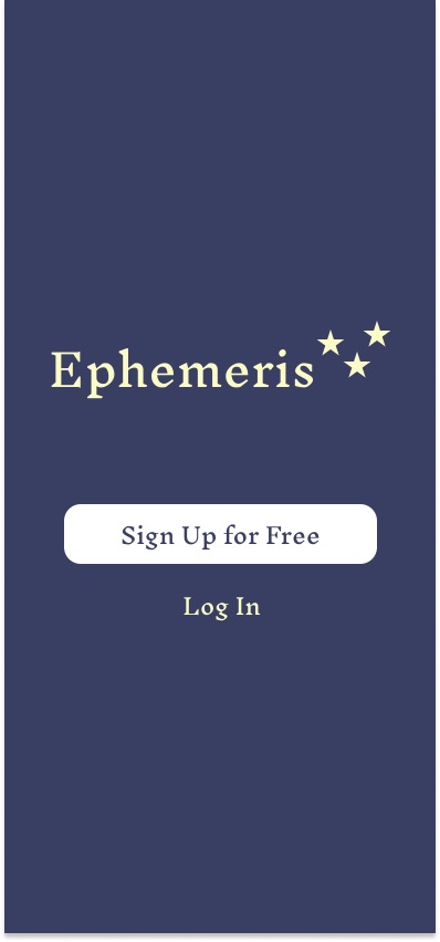
The logo grew out of the brand name and its meanings. A simple, mostly typographic logo, with the addition of the stars to add a bit of visual flair, while also nodding to its historical namesake.
The color scheme of light yellow on a dark blue background came from a desire to create a nice set of complementary colors with a contrast ratio that would be easy on the viewer’s eyes, while also evoking the night sky, per the app’s brand identity, in a subtle way.
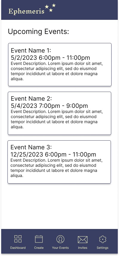
The main design principle of the app was to keep things clean and modern. While the opening splash page and on-boarding steps (login, sign-up, complete account / add friends) utilize the same font as the logo for a consistent look, the bulk of the app is designed with modern san-serif font. Page layouts are open, uncluttered, and full of familiar design elements to help guide the user through the experience. Similarly, the app makes use of buttons and displays with obvious titling so navigation and access of functions shouldn’t require a manual or knowledge of specialized inputs such as context-dependent directional swipes. After all, the usability of the app needs to be simple and intuitive so that learning to use it won’t be a barrier to entry for the already time-starved target market.
Site Map
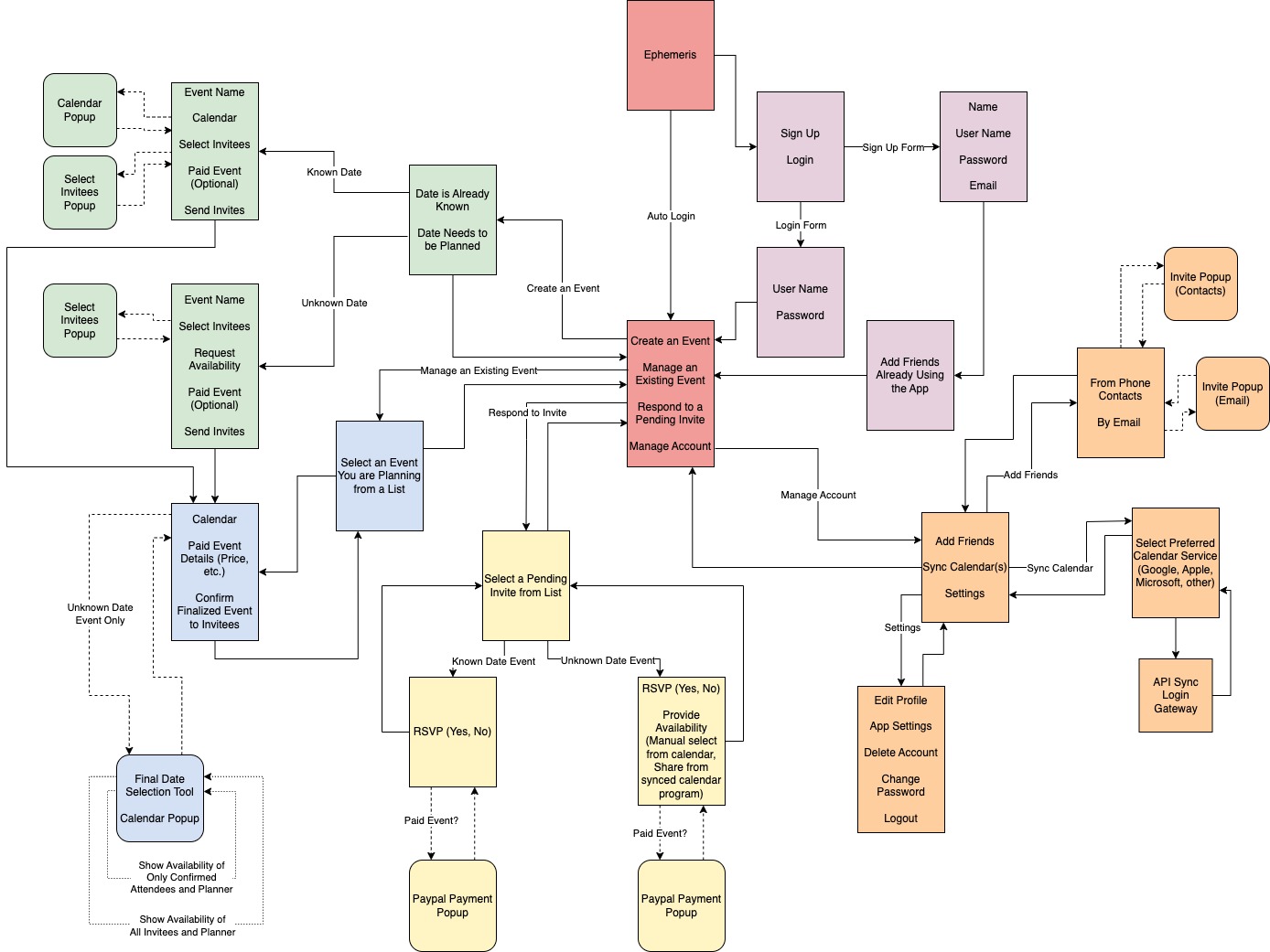
I took the core functions of the app, added the basic necessities such as a login and account creation process and an account management and settings section, and then mapped out how a user might move through each element of the app in a minimum viable product version of Ephemeris.
Wireframes
Knowing that my final step wasn’t a complete app, but simply a proof of concept prototype, I next decided which elements of the app I could or should not include in the final deliverable. The splash page, onboarding branch, and main page were all requirements of the CalArts course, but what to include in the remainder was up to me. As such, large sections, like all of account management, as well as small details, like paid event toggles, were left off so that the focus would remain on the most important aspects: making events, editing events, and attending events.
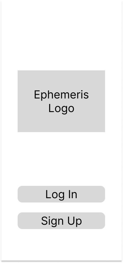
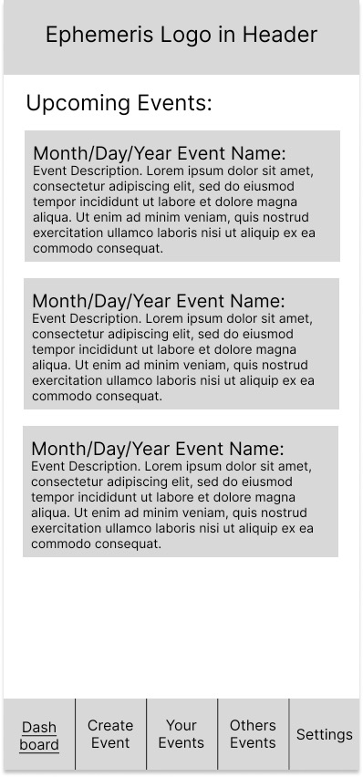
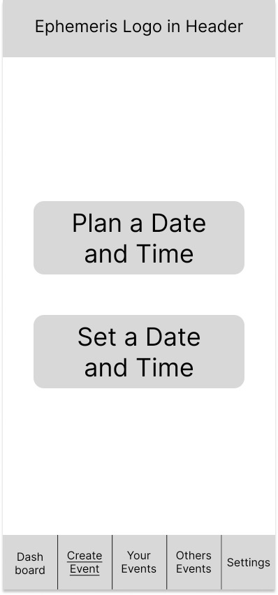
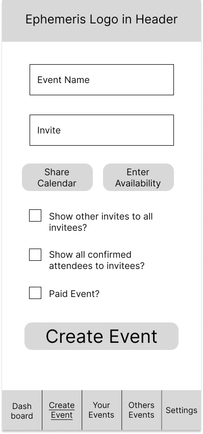
In order to beginning turning the app concept into a more tangible reality, I created a fairly comprehensive set of wireframes for this now reduced set of capabilities for the eventual prototype. A selection of those wireframes (the splash page, home page, and two event planning pages) are shown below.
Visual Mockups
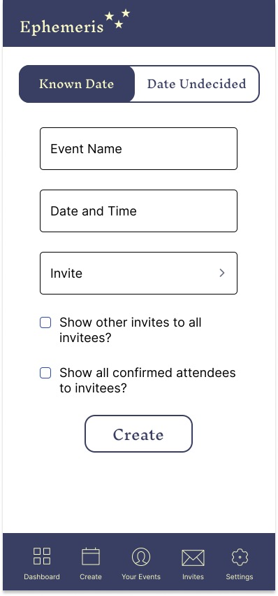
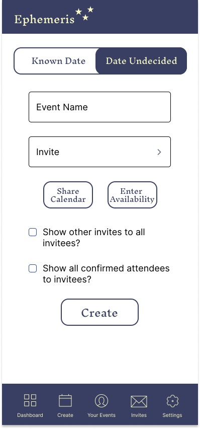
Visual mockups were easy, simply applying the visual language I had already developed to the formless versions of each page I had done for the wireframes. That said, a few interesting developments did occur during this process. For example, it became clear that it would be simpler and cleaner to have the ability to set whether an event had a ‘fixed’ or ‘to-be-determined’ scheduling on the event planning page, rather than with its own interim page.
Final Product
The clickable prototype, as submitted to CalArts with limited features, can be found here:
