Straight to the Point
Background
I have loved movies ever since I was kid and even, at one point, dreamed of being a feature film director. While at UCLA, I took classes in cinematography, editing, film history, and more. While the pie in the sky Hollywood dream eventually subsided, the love of film remained and, after years of opining to friends and family about the art and technique of movie making, they encouraged me to collect those thoughts and present them more critically. This is the website I made to post and share those writings with anyone interested in reading them.
Plan
Design a personal website to contain the results of my hobby of film analysis and written critique that:
- Is clean and minimalistic.
- Uses film art like posters, still frames, and fan art to ensure the visual element of the movies is not left out.
- Has a variety of ways for a reader to find a relevant review, through a robust and flexible search function.
- Is something I can be proud of, both for the quality of the writing and as a piece of design (UI/UX, web, graphic, etc.).
Results
I utilized WordPress’ robust blog tools, in combination with the highly flexible Divi theme and a few important add-ons, to create a clean, simple, and responsive site with an infinitely expandable library of review “posts” that have robust meta-data, sortability features, home page pagination, and more. You can see it for yourself here:
All The Nuts and Bolts
Audience
Initially, since this was just a hobby project, I didn’t have a specific audience in mind. However, as I started to work on actually writing the first reviews, I noticed that the choices in my writing style were suggesting a certain type of audience. I naturally fell into writing the same way I would talk to my friends about movies, most of whom were just average filmgoers that wouldn’t know mise-en-scène from a diegetic lighting source. I also frequently made comparisons between one movie and another, which makes the reviews readable if you know nothing but richer if you have some background in film. This organically moved me in the direction of an intended audience of people who like movies and have a decent depth of pop culture knowledge, but not super film fanatics who know the ins and outs of filmmaking or film history.
User Needs
The most simple user need is to find a review they are interested in reading. There are many types of movie reviews they could be looking for, such as a recently posted one, one of a specific genre, or one for a specific film, but the core need is the same: to find a review they are interested in.
Client Needs
As I was my own client, my needs were easy to understand and execute. I wanted a place where I could put my hobbyist musings on the movies I’ve seen and be proud of both the quality of the writing and the professional look and feel of the site. It was important to me that the nature of the site be elevated above a basic blogroll layout a la Tumblr or default WordPress.
Visual Language
I researched other film-centric websites of various kinds, such as review sites, review aggregators, content libraries, and film social sites, looking for the various ways other people had thought about displaying films, both visually and textually, in various contexts.
I started to generate ideas that would ultimately come to fruition during the wireframing phase, outlined below, but I also began to formulate the unifying visual language. I didn’t like how busy certain sites were, such as Letterboxd and IMDB. I also knew I wanted to use images such as film posters, fan art, and stills from movies. As a result, I decided to target a minimalist, primarily black and white core aesthetic that would allow the punctuations of colorful film art to pop off the page.
I also developed a logo during this time, with the help of a friend, that plays with the site name and purpose. The interior word “views” in erikreviews was bolded and separated by some concentric circles that call to mind a camera lens from front on, as well as highlighting the layered meanings of reviews (a critique), re-views (to watch again), and views (to have an opinion on something).
Site Map
In keeping with the fairly minimalist visual language, the site didn’t need or want a lot of complexity to its navigation. I considered, and then rejected, additional pages, such as a glossary of film terms, but decided these were ultimately extraneous. For example, I realized I didn’t need a glossary anymore after I chose to write in a more plain English style, with limited insider terminology and care taken to explain any such language when utilized.
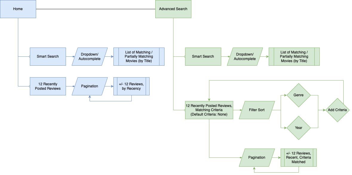
As a result, the site ended up with just two main pages: a home page and a dedicated search page. The home page has the most relevant user needs upfront: a simple title based search bar and the most recently published reviews. Through pagination, a user can scroll through all of the reviews published to the site without ever leaving the home page. The dedicated search page repeats access to the titled search bar, while also providing a library of reviews that can be filtered by genre and release year.
Although not very complex, I diagramed the features of both pages in a UX flow, shown below.
Wireframes
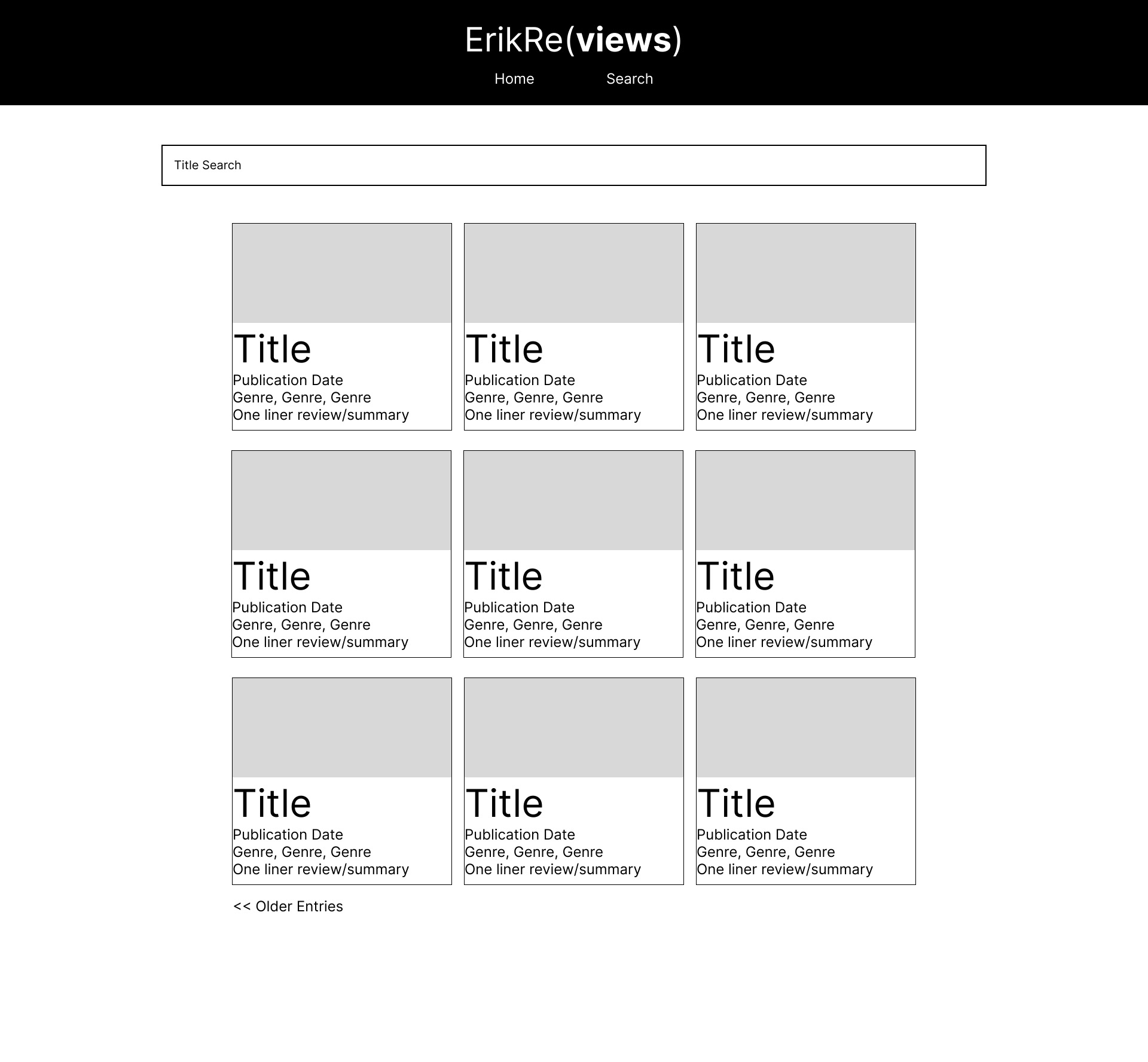
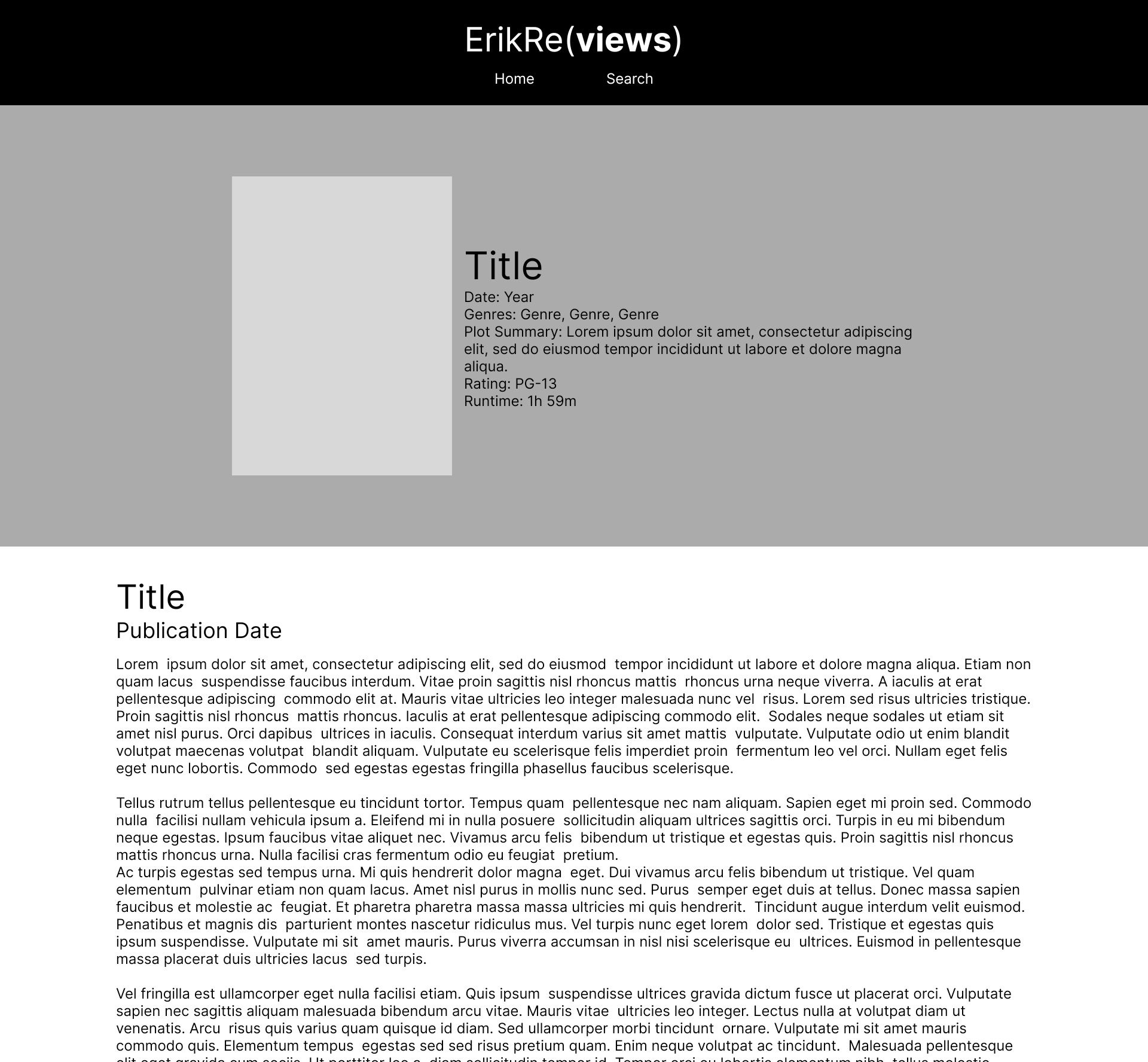
The initial layouts drew heaviest inspiration from Roger Ebert and Netflix. From Roger Ebert, I really liked the idea of a top image that represents the film sitting above the text of the review. Netflix, as well as imitators such as Kanopy, Tubi, or the Roku Channel, informed the use of a grid layout for locations that display multiple movies, like on the home page.
The Movie Database helped me refine what that top image could look like and where to include other important information such as a plot summary, genre, runtime, etc. The Movie Database’s version was too cluttered for my intentions, but the general idea of a poster, title, and film details overlaid on a banner made using film art was one I really liked.
Visual Mockups
The art that would fill in all the various wireframes, i.e. the postcards for the grid display and the poster and banner pieces for each review, would be primarily sourced from FanArt.tv, a donation supported and fan submitted source of free to use film art in a variety of formats. I focused on the Poster, Background, and Movie Thumb styles for my uses. If art couldn’t be sourced from there, for whatever reason, The Movie Database’s art collection and a little photoshop could be used to fill in those gaps.
Although this occasionally meant that some films, particularly more modern or popular/famous movies might have amazing fan art backgrounds for their banners, others would have to make due with merely a still from the movie. Still, I was happy with how this hybrid solution came out despite those slight irregularities.
To fill in the written details, I would use IMDB and The Movie Database to get the release year, run time, plot summary, and genres. While not always perfect, I knew that I didn’t have to copy these one for one, and could make edits as I saw fit for any particular film. For example, if I felt IMDB had not included a genre I thought should be there, I could simply add it myself while I filled in the page.
Lastly, I implemented the final version of the site’s logo, replacing the textual placeholder in the wireframes. I liked the idea of the top bar being pinned to the top of the page for easy navigation, but with this logo being taller than the placeholder, I worried it would take up too much real estate with black, empty space. To fix this problem, I made a note to have the logo and the rest of the empty space hide itself as the user scrolls down, so only the relevant navigation elements would stay pinned to the top of the page as a visitor reads.
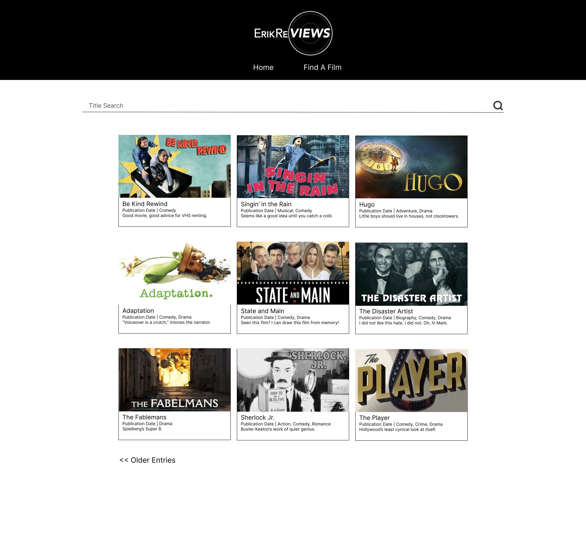
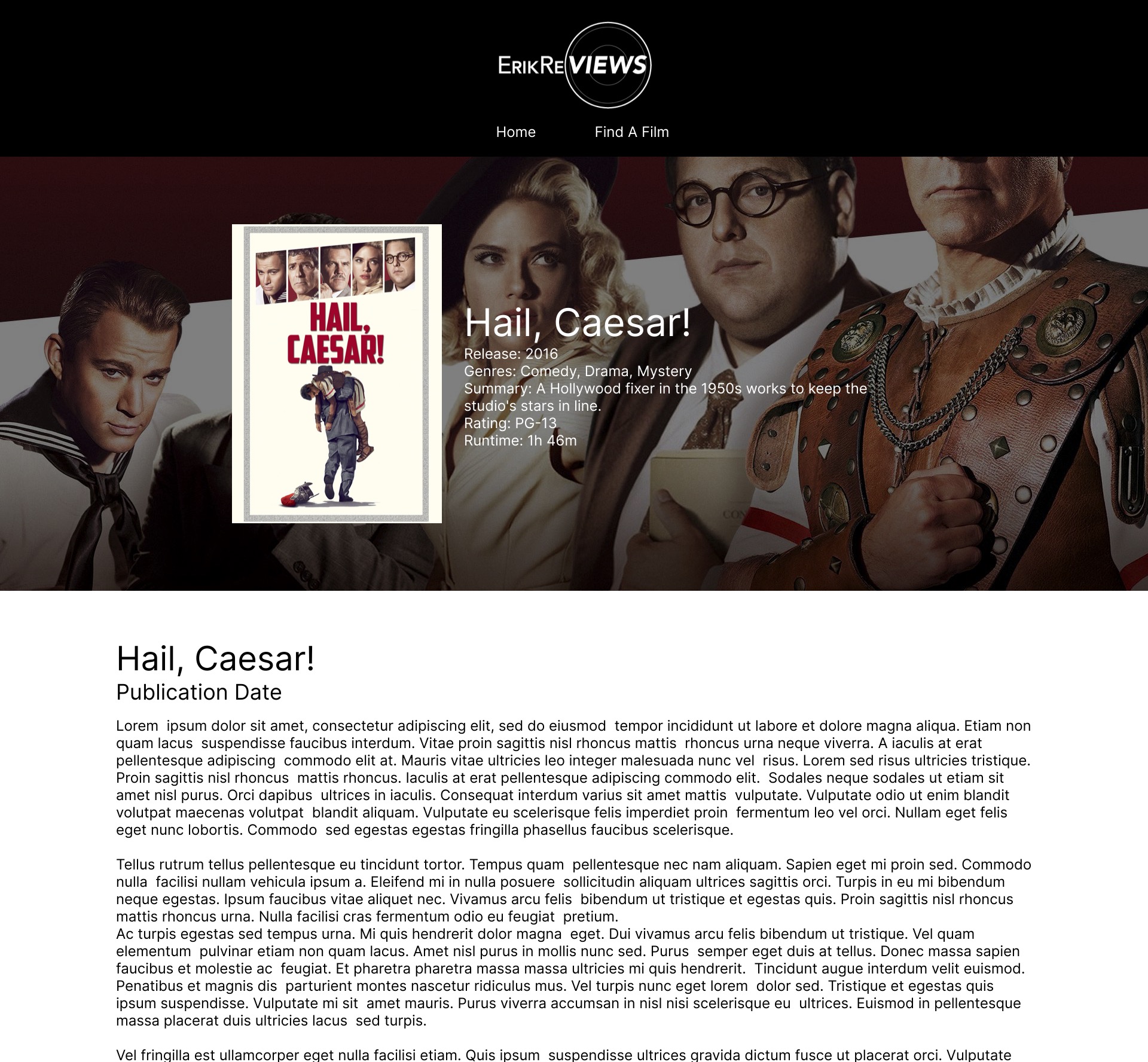
Final Product
The end result is a clean, minimalistic, responsive site that uses the visual splash of bits of film art to spice up its largely textual content. You can see it for yourself here:
