Straight to the Point
Background
Paratus Institute is a first aid training company that has been in business for over fifteen years. Their classes are designed for a niche audience of serious outdoorsmen, as their flagship class, Wilderness First Aid, focuses primarily on how to handle medical emergencies where professional help may be many miles, and hours, away.
In the early 2010s, they reworked their Wilderness First Aid course to include a blended learning experience, mixing an online “lecture” component with an in-person hands-on learning experience, including a series of intensive practical scenario exercises. This gave their students the ability to work at their own pace through the class materials, freeing up the instructors to focus on answering questions and coaching the practical elements.
Recognizing the need to adapt to the growing usage of smart phones and tablets for just about everything, I was tasked with reworking every aspect of Paratus Institute’s web presence with modern, responsive design in mind.
Plan
The design language should be simple, flexible, and focused on making Paratus’ materials available whenever, wherever, and however a student wants. Regardless of the device their using, a visitor to the site should be able to easily:
- Learn about the company and quickly develop trust in the quality of the classes they teach.
- Learn about how Paratus classes operate, what kinds of classes they offer, and how to express interest in requesting a class if there is no current option that meets their needs.
- Register for an existing class.
- Create a student account and be able to access Paratus course materials once registered.
- House all of the additional materials, such as printable forms and checklists, Paratus instructors might want to reference or recommend to their students.
Results
In keeping with Paratus’ commitment to being “available whenever, wherever, and however” the new design was a simple, responsive site that would work equally well on mobile, tablet, and desktop. You can see it for yourself here:
All The Nuts and Bolts
Audience
It is tempting to simply say that the target for the website is anyone interested in expanding their first aid knowledge, with a bias towards campers and high adventure enthusiasts.
However, most of the company’s business is from word of mouth within local Bay Area outdoor groups, such as Boy Scouts of America. Also, while the courses are generally designed to be appropriate for anyone ages 16 and up, under 20s who join Paratus classes are almost always there at the prompting of their parents or another mentor figure in their lives.
As a result, the audience for the site isn’t exactly the same as the audience for the company’s course offerings. The audience for the site tends to be middle aged or older, leaders in an outdoor-focused program, and more likely to have a career in STEM or business management (per the demographics of the San Francisco area).
User Needs
The user needs can be broken into two categories: informational needs and access needs.
Informational needs are all the things that a potential student needs to know about the company: How much experience do these guys have? Can they be trusted? What do previous students think about their courses? What will my time commitments be if I take a course? Are there any classes currently offered and when/where are they going to be held? And so on…
Access needs are how that information is acquired. Given that Paratus Institute students are likely to be in a higher percentile of tech savvy and early adoption than the average, they are also more likely to want ease of access for both information and class materials in any browser, on any device, anywhere they can get internet access.
Client Needs
Luckily, most client needs mirrored user needs. Paratus’ goals around image and marketing neatly aligned with the informational needs of a potential customer. How much experience do these guys have? The site should be very upfront about the instructors and their level of qualifications as its a major selling point of the organization. What do previous students think? Since word of mouth is an integral part of the business, testimonials are a natural fit for the website.
The other client need was to grease the wheels of finding, signing up for, and taking classes. Paratus values an uncomplicated student experience and so putting barriers between the visitor and their desires, in the name of stylish design or shameless self-promotion, was something to be avoided.
Visual Language
This was part of a larger project I helmed to update the company’s overall design language, such as a new visual identity and course materials, so I leaned on the aesthetics I developed during that part of the process when thinking about the look and feel of the site. For example, the green from the logo became a seed for an earthier palette of green, light brown, dark blue, and red.
In order to facilitate an easy transition from mobile to desktop versions of the site, I originally considered a one page style layout. The resulting wall of text would be broken up with either outdoorsy images or blocks of color to create visual interest and use anchor tags to aid in navigation. Eventually, it became clear that there was simply too much information to pack onto a single page. Still, the basic idea had merit so I opted to expand it from one to three long pages, each one acting like a single page layout, a process I explore in more detail in the Site Map section below.
Site Map
After realizing I shouldn’t try and contain the site to a single page, the next step was to figure out how it could be divided.
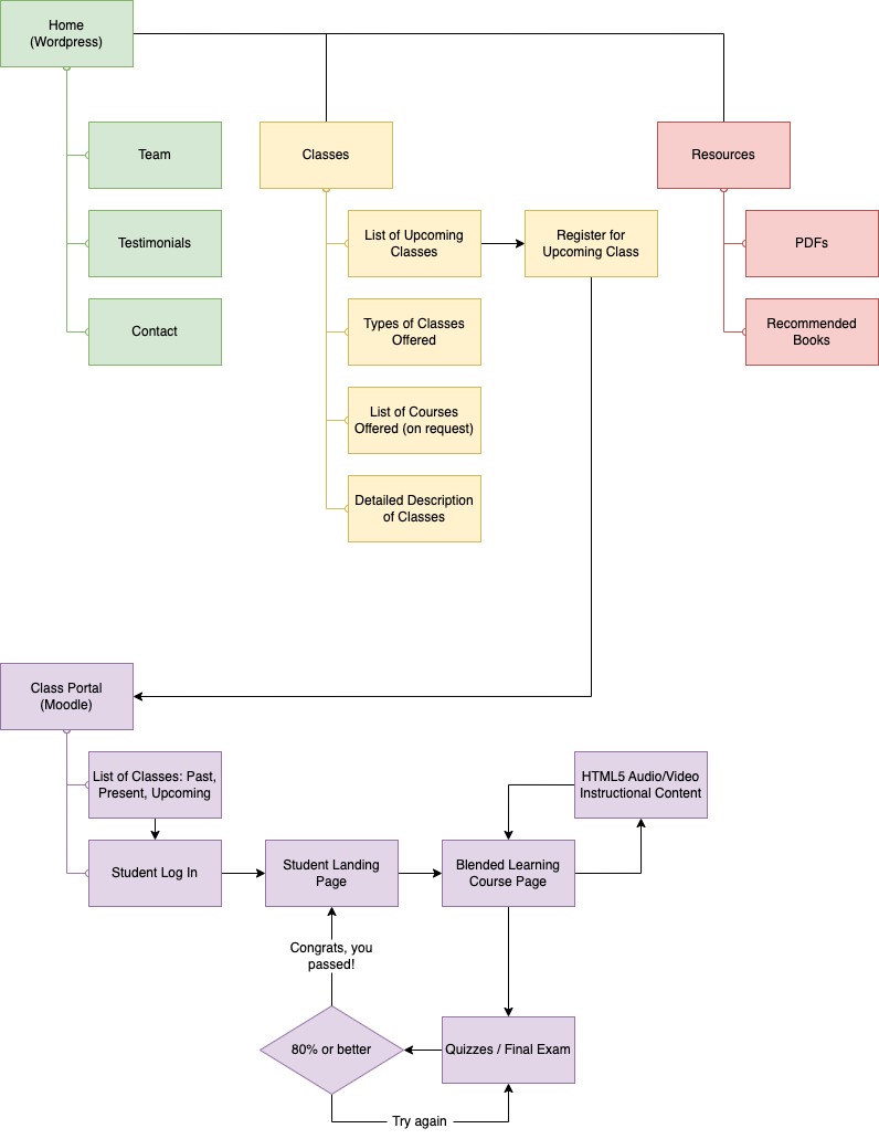
When sorting the website’s non-negotiable categories, the most logical arrangement was to split things into three “buckets.” Bucket one was everything company: who Paratus is and why you should trust them to teach you. Bucket two was everything class related: what are they offering now and what might they offer in the future. Bucket three was resources: all the things Paratus might ask or recommend students use as supplemental materials.
From this bucket sorting, a logical user flow emerged. Visitors were most likely to want to access resources only after they had taken a class. Visitors were only likely to take a class if they trusted the company. Therefore, the site should make earning the trust of a potential customer the highest priority (first item in the navigation menu, placed on the home page), easily accessible class information and registration the second highest priority (second item in the navigation menu), and useful resources like downloadable PDFs and book recommendations the lowest (last item in the navigation menu).
Finally, for implementation reasons, the web experience needed to be split into two domains. The high level domain would run on a Content Management System (CMS) for easy maintenance of a traditional website built to house all the things you would normally expect from a company website. WordPress was ultimately selected for the CMS. A subdomain for classes would run on a Learning Management System (LMS) for easy management of the e-learning aspects of the business such as course management, student registration, quizzing, grading, and so on. Moodle, already Paratus’ preferred LMS, was updated and moved to the new subdomain to fill this function.
Both halves were diagrammed as part of the site mapping process, as shown below.
Wireframes
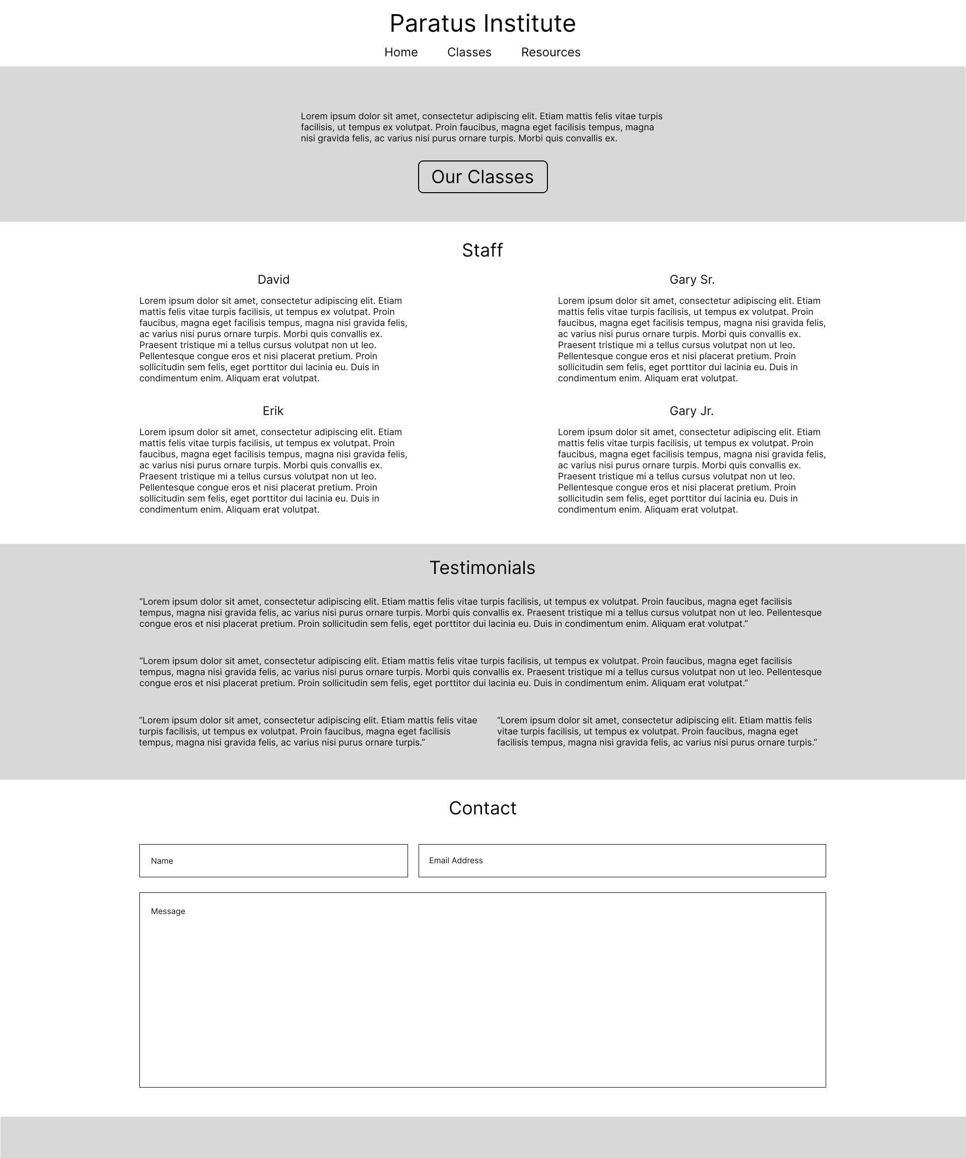
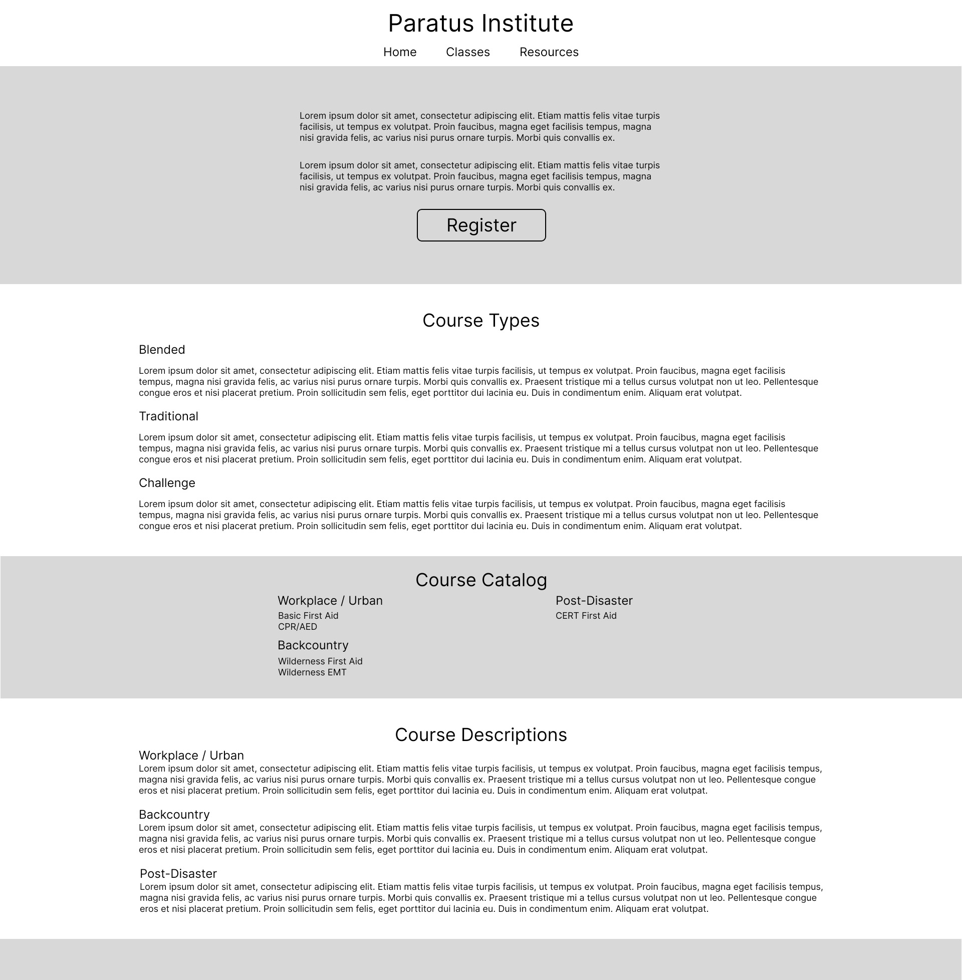
The big addition in the wireframing process was the call to actions. Since Paratus wanted a uncomplicated user experience, but user and client needs demonstrated the advantages of placing corporate information front and center (rather than class information), something had to be done to vector students who were already familiar with the company to what was most valuable to them: current active classes. Hence, a call to action at the top of the home page that would direct them to classes and a call to action at the top of the classes page that would direct them either register for, or express interest in, a coming class.
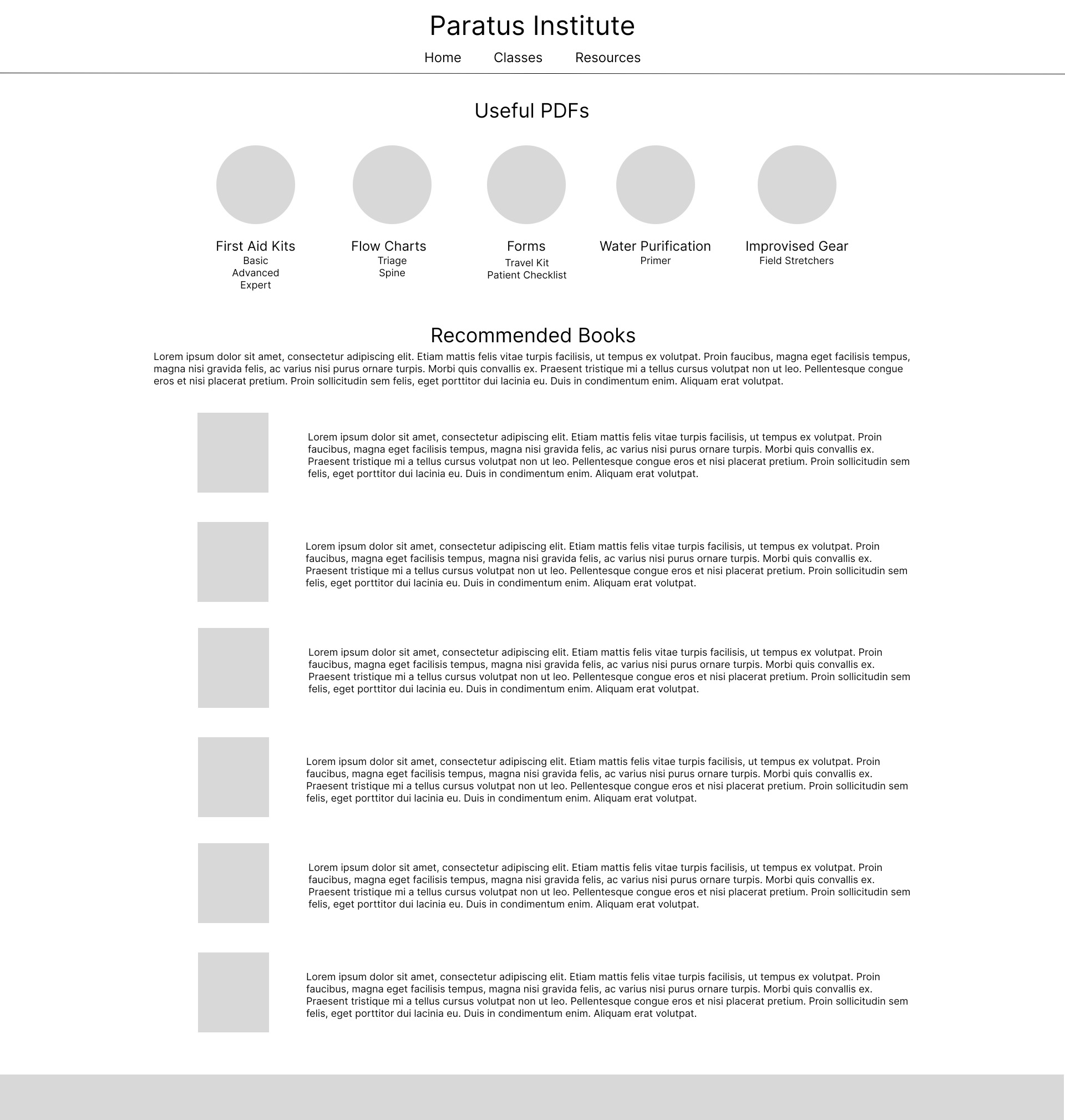
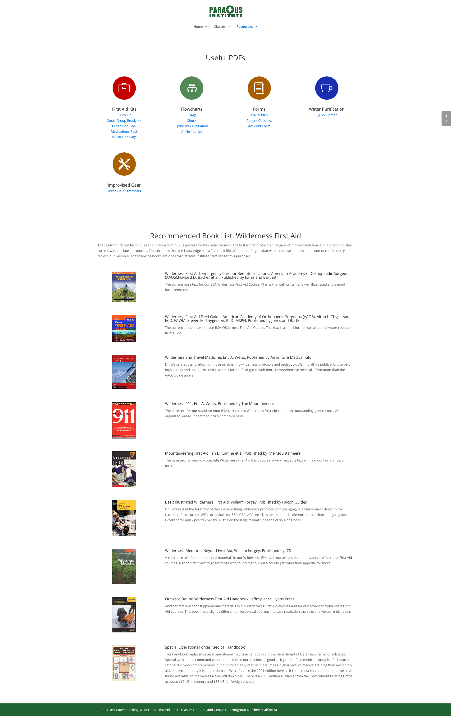
Outside of the call to actions, the rest of developing the wireframes was really about how to organize the material by importance. These early layouts aimed to put the most relevant information at the top and, when possible, have a logical flow of information as you moved down the page. For example, in the wireframes below, you can see how the resources page puts the PDFs, charts and checkoff sheets the students will want to find, download, and print for use both in and outside the class, above the book recommendations, which aren’t required of any course but are worth reading if the student has the time/interest.
Visual Mockups
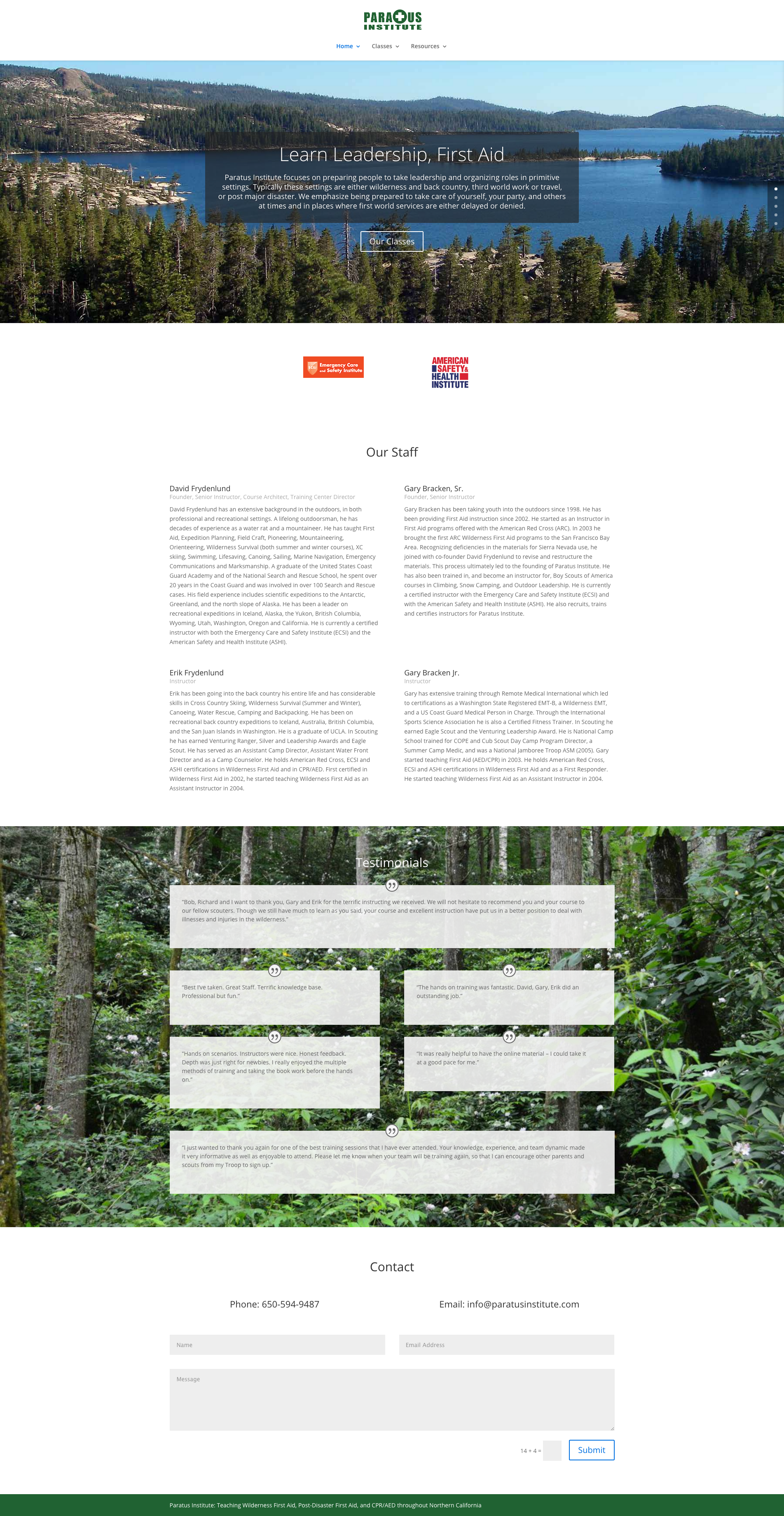
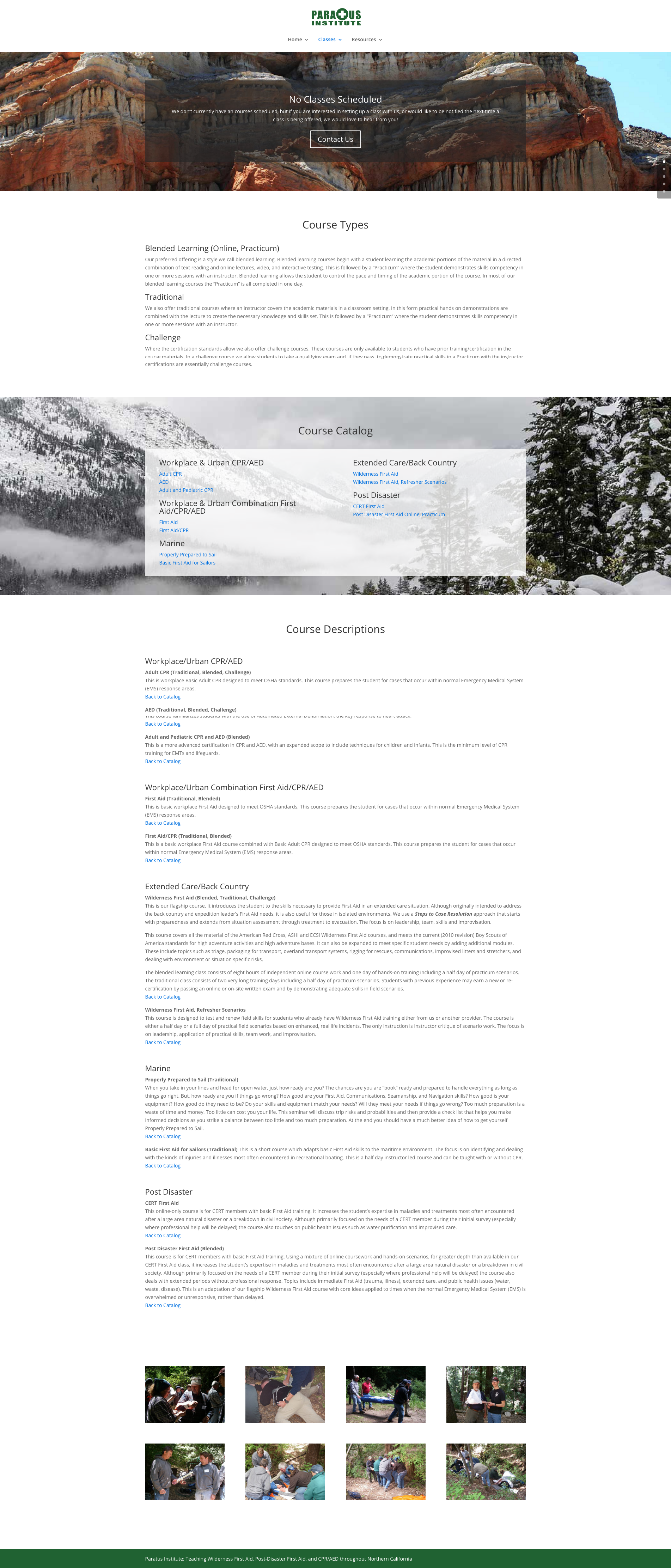
To complete the visual mockups, I took the layouts of the wireframes and filled them with the content that would eventually populate the site: pictures to replace the grey blocks, the company’s copy to replace the filler text, and icons and images to flesh out the smaller details like book covers and downloadable PDF categories.
During the process, some small tweaks to the padding were done to help open the pages up after adding the content revealed the layouts felt more claustrophobic than intended.
Finally, a few extra pieces of content, not originally in the wireframes, were added. Images for Paratus’ partner agencies were added to the home page so that potential students would know, at a glance, what organizations Paratus worked with to provide the final certificates, and a photo album was added to the end of the classes page to show examples of the hands-on opportunities that are a big reason why Paratus gets so many repeat customers.
Final Product
The end result was a simple, responsive site that would work equally well on mobile, tablet, and desktop. You can see it for yourself here:
