Straight to the Point
Background
Venturing is a branch of Scouting BSA (formerly Boy Scouts of America) that offers co-ed high adventure outdoor activities for 13-21 year olds. Founded in 1998, the program is relatively new by Scouting standards, as well as relatively obscure.
Having seen my work for Paratus Institute, I was approached by the adult leadership of my former unit (Crew 27) to modernize their website, which hadn’t seen a major update in more than decade.
Plan
Develop a website that can serve the needs of a wide range of potential users: current members, prospective members, past members, current parents, prospective parents, and current adult leaders:
- With the axiom “a picture is worth a thousand words” in mind, use the crew’s extensive picture library to show how fun and exciting crew activities can be.
- Create plenty of guideposts to direct users to the “zone” of the website that is most relevant to their visit.
- Make each of those “zones” distinct enough to aid navigation, but in a way that still keeps the site feeling like a cohesive whole.
- Show off the crew’s activities, both past and present, whenever possible to reinforce the idea of both the crew’s quality and longevity.
Results
I built Venture Crew 27 an entirely new site, from the ground up, in WordPress, using the highly flexible and modular Divi theme, some powerful add-ons, and a tiny bit of coding (CSS and Javascript). You can see the final product here:
All The Nuts and Bolts
Audience
A complicated aspect of the website’s design was that it needed to be built with four completely distinct types of people in mind: kids already in the program, adults whose kids were already in the program, kids who were thinking about joining, and adults whose kids were thinking about joining.
Each of these groups want different things out of the website, yet none can feel alienated by it. After all, a potential new member who is excited about the unit still isn’t going to join if their parent doesn’t approve. This risks developing a design that, in an attempt to appease everyone, serves no one.
In order to wrap my head around this conundrum, I created four user personas:
Kevin, crew member: 14-15 years old. Been on a number of crew trips but is now ready to graduate to more advanced outings such as Super Trip or Winter Wilderness Survival with the ski patrol.
Grace, mother of Kevin: Middle aged. Not much of an outdoorsy person but is supportive of Kevin’s interests. Drives Kevin to and from meetings.
Amy, looking to join: 13-14 years old. Interested in the outdoors and/or has an adventurous personality. Has a friend or sibling who is either already in Venture Crew 27 or at least in Scouting generally.
James, father of Amy: Middle aged. Concerned for the safety of his kid in the program. Heard of Scouting but knows little to nothing about Venturing. Is an outdoorsy person and might be interested in getting involved as an adult leader if the fit seems right.
User Needs
Each of the different user personas have different needs:
Kevin uses the website to look things up.
- Needs information for outings such as pack lists, ideas for camping food, and backpacking guides.
- Needs information about advancement such as the requirements for certain ranks and guides to help accomplish those requirements.
- Needs information about administrative tasks such as planning an outing.
- Needs to find and read various reminders, primers, and curriculum for venturing skills such as shelter building, pioneering, or fire building.
Grace wants to stay up to date and feel involved.
- Enjoys reading the trip reports.
- Wants to see what outings are coming up, in case they effect the family calendar.
- Is potentially interested in ways she can volunteer that don’t require going on camping trips or other high adventure activities.
Amy is curious about what she would get to do as a member.
- Wants to see what kind of activities the crew does.
- Wants to know more about this super trip thing.
- Wants to know if she can try things out before deciding to join.
James has a million questions about the program.
- Will this be fun for his kid? Will his kid get to do things they wouldn’t normally get to do? Will they be able to make new friends? Will this help foster or expand new interests and/or hobbies?
- Will this be safe for his kid? How long has this unit been around and what is their reputation?
- Will this help his kid stand out? Does the program offer advancement that would look good on a college application?
- Will this make his kid a better overall person? Will there be volunteer opportunities? Will there be character building? Will his kid be able to learn life skills?
- If I also like the outdoors, is there some way I can be involved too?
- Once we decide to get involved, how does that work? Where and when do you meet? What are these uniform requirements and where do we get uniforms from? How much is everything (from dues to trip fees) going to cost?
Visual Language
One of the main goals of the visual language, something that should be effective for all four personas, is to make the program look exciting and fun. Given that a picture is worth a thousand words, what better way to let a visitor know what the crew is about than to show them through the heavy use of photography. And, rather than fill the site with generic stock images or assets provided by Scouting national for marketing purposes, I could use photos of the crew’s own activities, taken from throughout the crew’s long and storied history. With that in mind, I conceived of not only impressive banner images on each page, but also photo tiles for buttons, photos to accompany trip write ups, photos as a way to break up walls of text, and so on.
Similarly, the crew had been producing videos yearly, around their flagship summer “Super Trip,” as well as a compilation piece made around the time of their 15th anniversary. These seemed like such strong marketing tools, I wanted to keep an eye out for where they might fit in the grand design of the site.
Finally, the last major anchor for the visual language was a color scheme. The crew’s existing visual materials, such as official member shirts, crew logo, etc., all made use of the a darker, forest green picked by Scouting as Venturing’s primary color identifier. It made sense to also use this as a key color for Venture Crew 27’s website, and accent colors were selected using complimentary colors on a color wheel, with attention given to selecting exclusively earthy hues to maintain a consistent impression of outdoorsy-ness across the site. That led to forest green, clay red, orangy-yellow, and dark blue being the site’s key colors.
Site Map
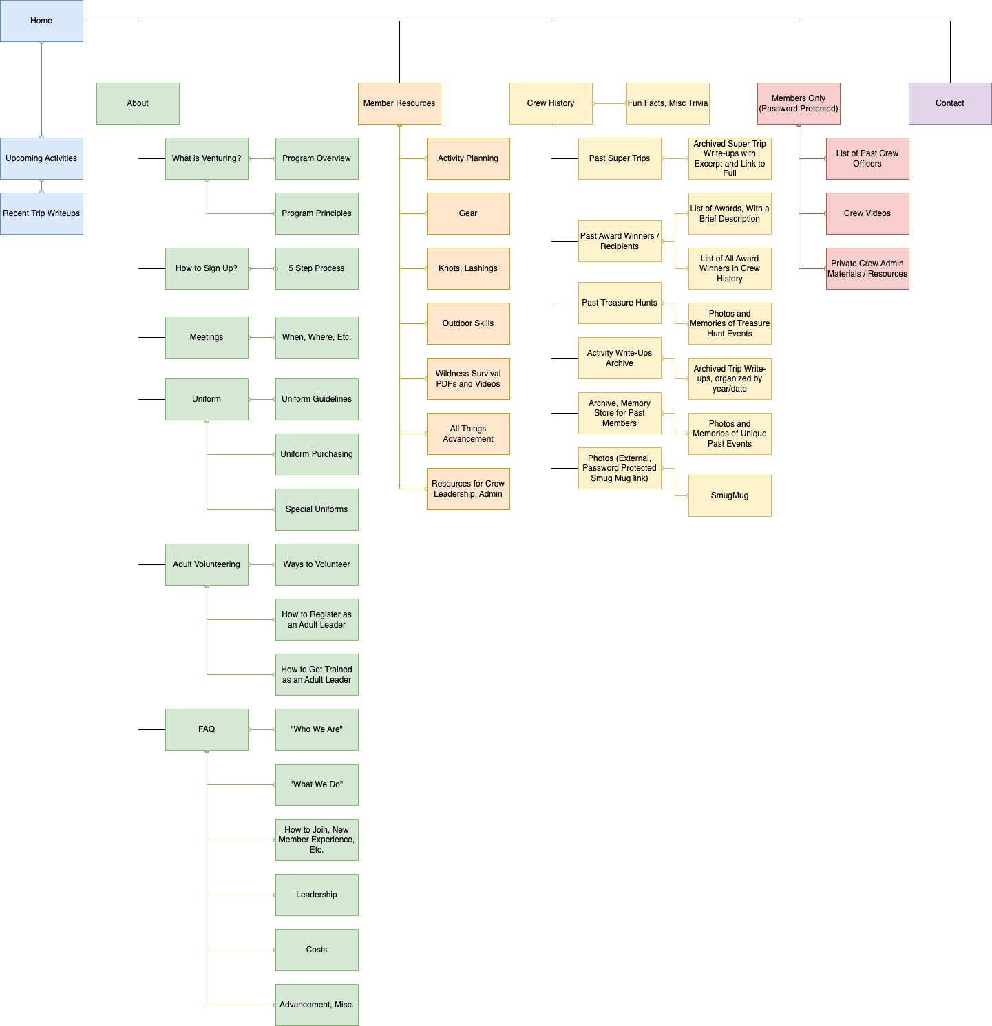
The user personas provided a great jumping off point for understanding the UX flow of the site. Those user needs can be grouped into three major super categories: About, Resources, and History. Kevin’s needs can be largely filled with Resources, and the other three with About and History in different proportions, according to their unique mix of needs.
Both Amy and James might want to follow up their interest with more direct communication, so a contact page was added.
Upcoming activities were added as content to the front page for the needs of Grace, but also Amy and James’ desire to know what the crew offers in the way of trips and general program.
Finally, the client had two additional, excellent ideas:
The first was to make sure that the site didn’t forget the nostalgic interests of past members. This was easy, as the History section could do double duty. By making sure the references to the crew’s history went back as far as possible, it could both demonstrate the longevity and breadth of activities the crew has provided to potential new members, and their parents, and act as a repository of memories for former members who want to be reminded of their past experiences.
The second was to point out that certain content should be password protected and for active members and their parents only, since pictures, names, and other sensitive information might be a risk to the safety of kids in the program if left on the public parts of the site. Again, an easy fix. A Member’s Only area was included in the map.
Wireframes
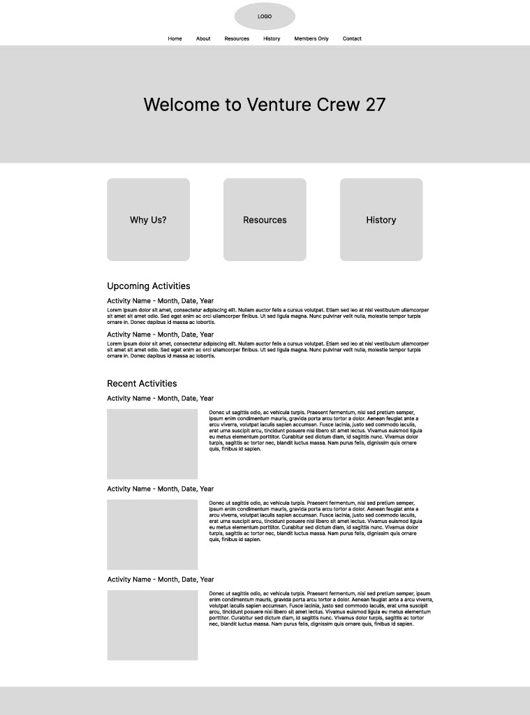
Since the user persona work revealed that there were potentially a lot of different types of people looking to get different things out of the site, it was important that they be able to find what they were looking for quickly. I wanted the home page to have an easy and obvious navigational element in the main content (not just in the top navigation bar) that would guide them to their desired ends using the super categories developed in the site map process.
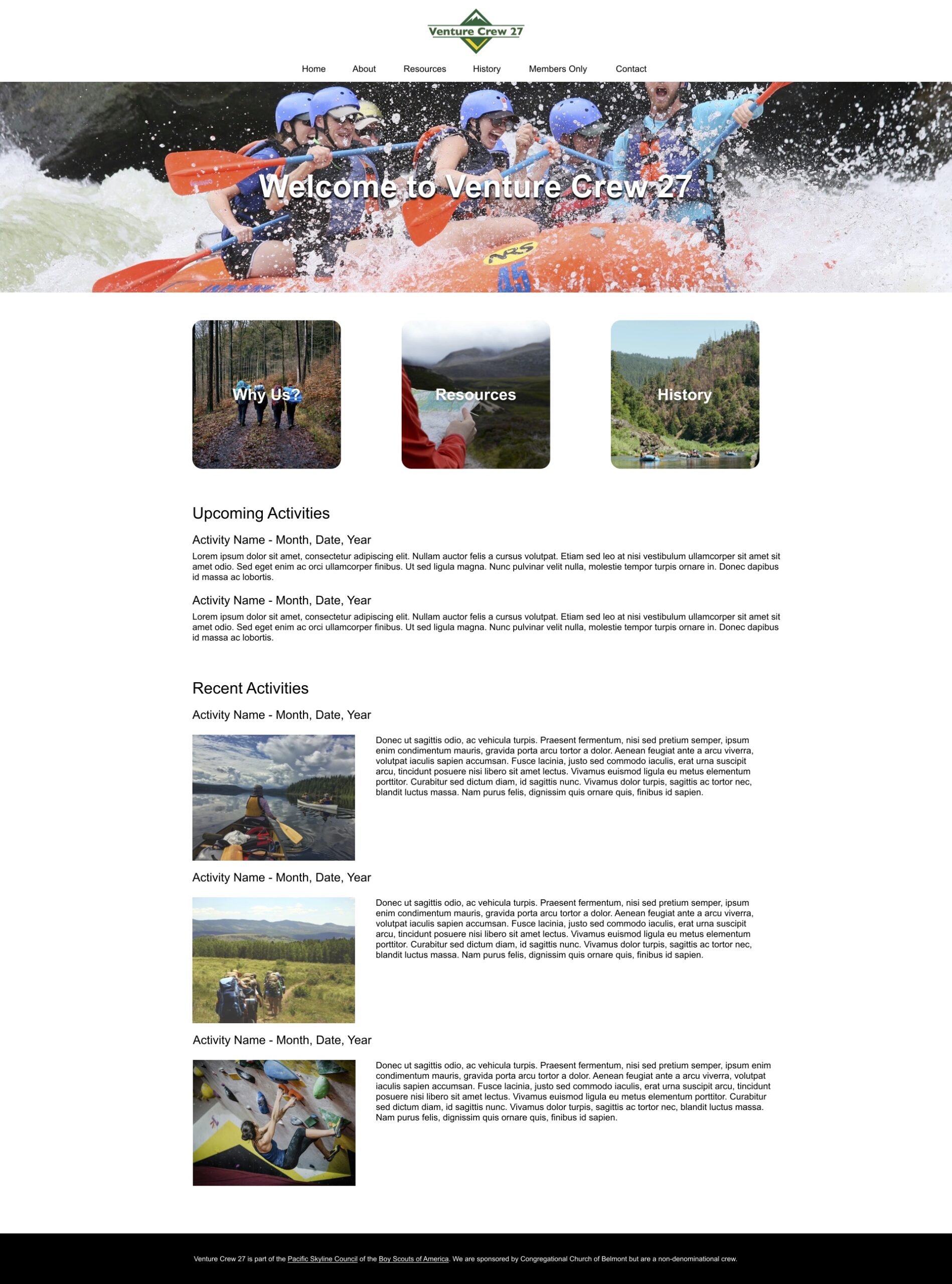
The rest of the home page was filled with what best represented the organization, was relevant to all four user personas, and was important not to bury somewhere deeper on the site, i.e. a snapshot of the crew’s upcoming and recent activities.
The core idea for the rest of the site was to divide the bulk of its content onto pages that corresponded with the super categories developed during the sitemap: About, Resources, and History. Members Only and Contact would, by comparison, get relatively simple, single function pages.
I wanted to give each of the pages for those categories a different look so there would be visual clues as to which part of the site you were on, while keeping things like the top bar, header, text (and eventually color scheme) the same so the site still feels like a cohesive whole.
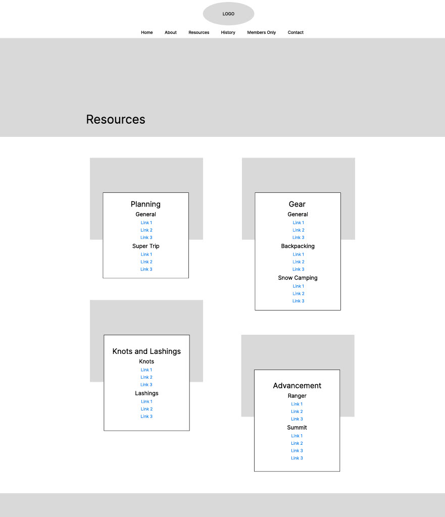
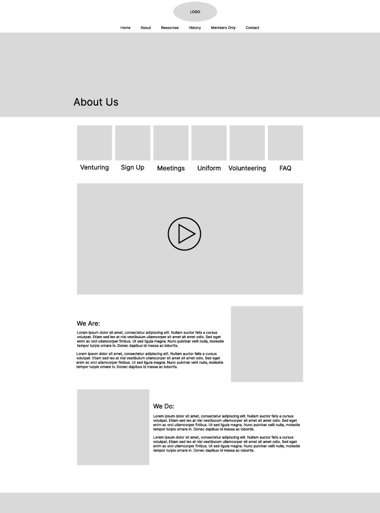
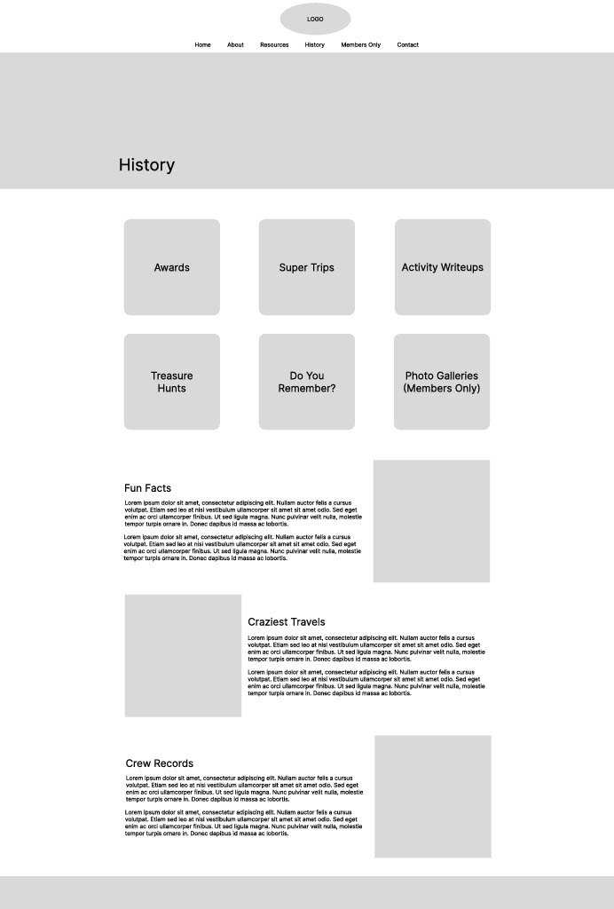
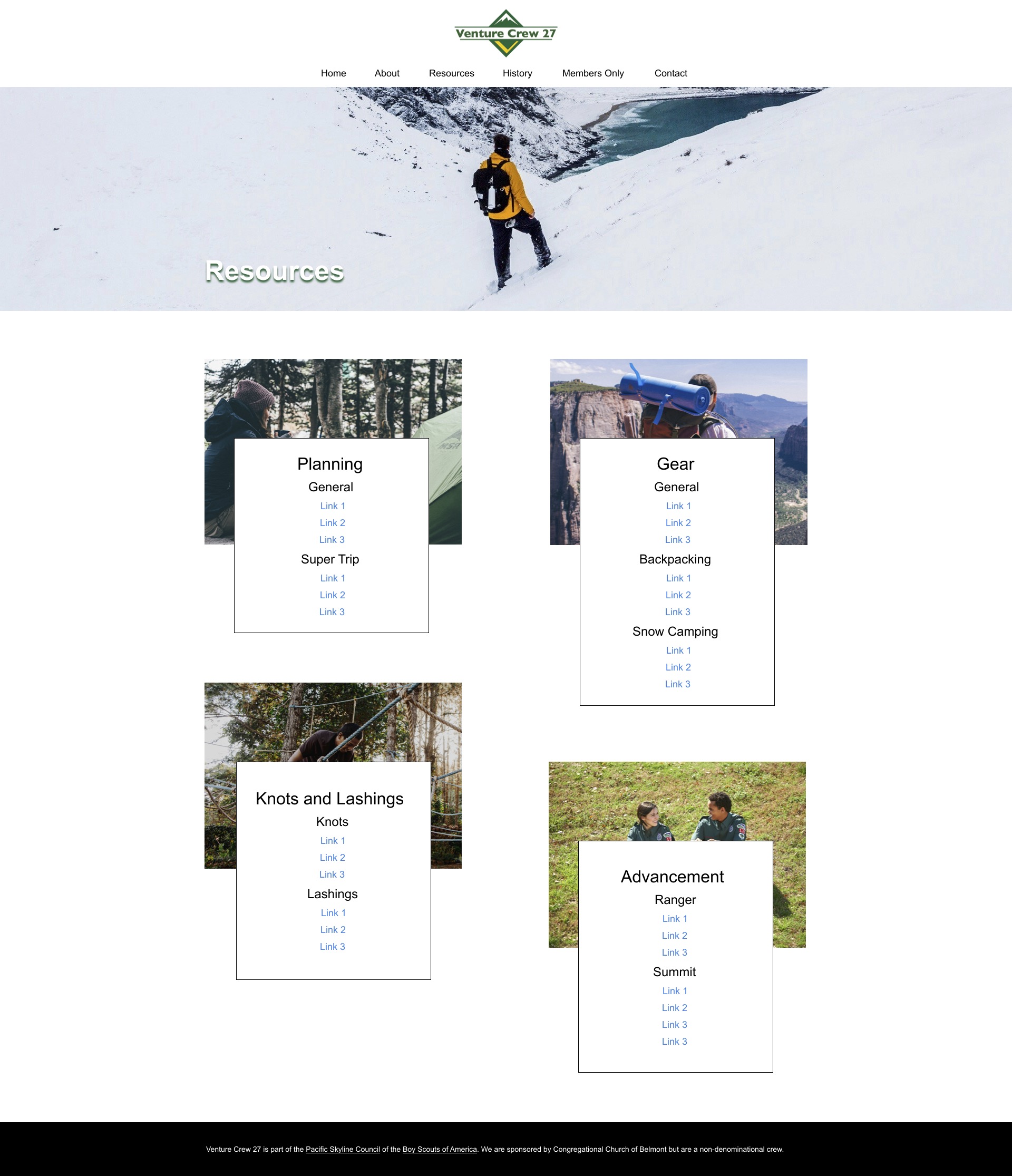
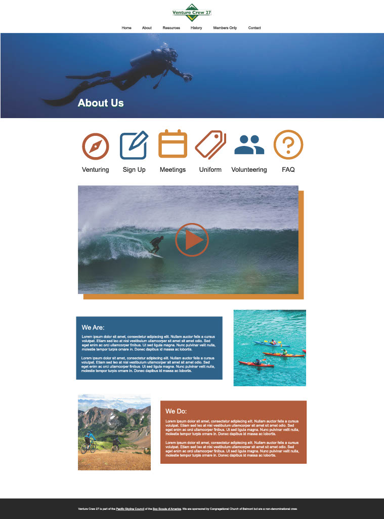
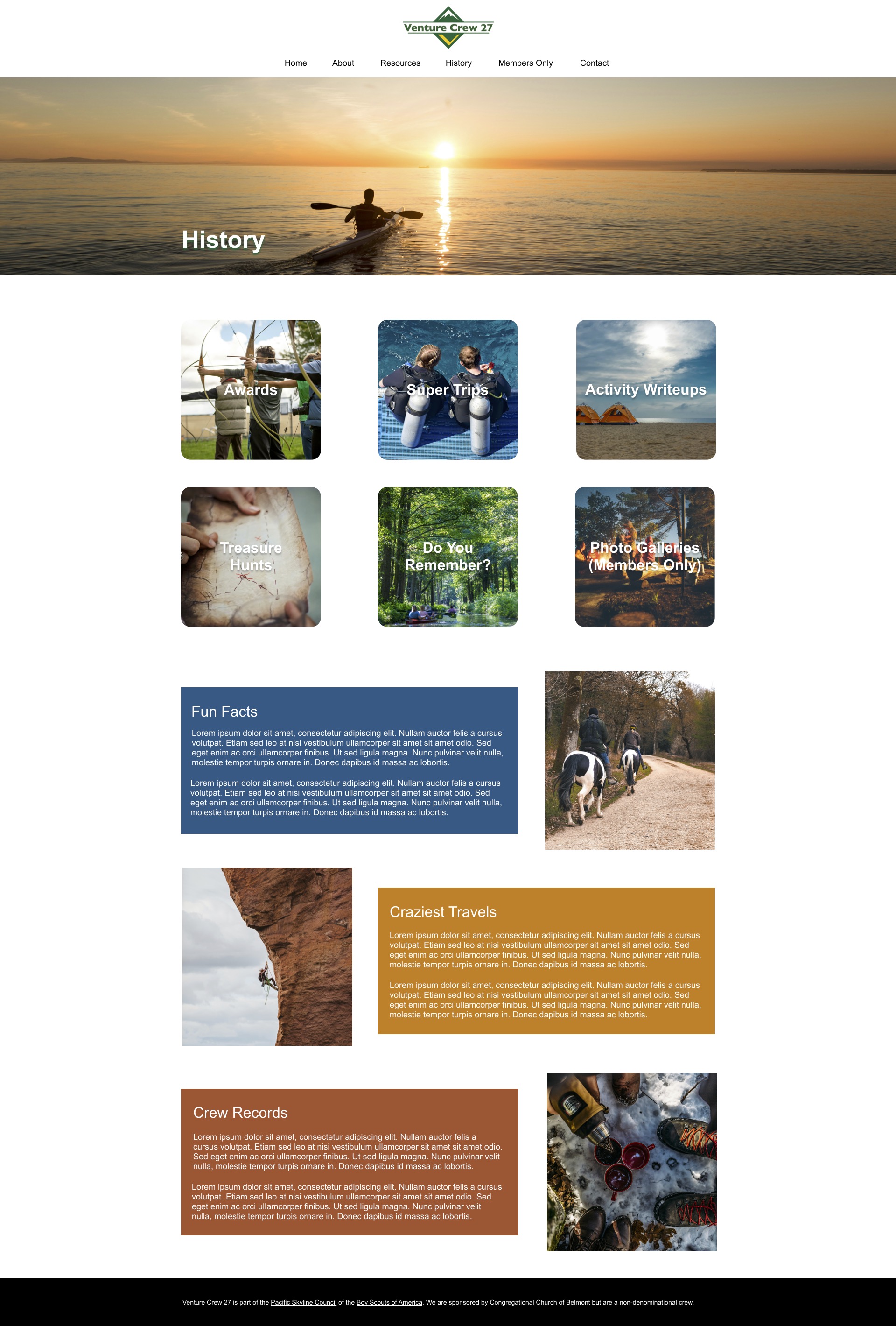
About was envisioned with icons as a secondary navigation bar, followed by a video and some brief paragraphs explaining the crew’s history and identity. Resources has a series of (mixed internal and external) links, with some added graphic design to make it less like a boring list. History has picture tile navigation, like the home page, and some fun facts about the crew and its history.
You can see how these ideas informed the wireframe prototypes in each of those key pages (Home, About, Resources, History) below. You may also note that, as shown by the plethora of grey boxes, the visual language develop for the projected was reflected in the ample space for integrating photos and videos on every page.
Visual Mockups
The visual mockups accomplished two main things. First, by populating the spaces left for images with stock photos of high adventure activities, the client could get a better feel for how the site would look once the crew’s own photos were put in their place. Second, by bringing in icons and adding color splashes behind some of the text, the client could see how the chosen color scheme would effect the final look of the site, making certain elements pop in a way that wasn’t obvious in the wireframes.
Final Product
The final step was to take the entire design concept into WordPress and make it real. In addition to swapping out the stock photos for photos of the crew itself, a few other things changed. For example, the green of the color scheme had shifted from the key color to more of a member of the color ensemble, used in things like hover effects and buttons.
The biggest change, however, was swapping the image on the home page header for a looping video (also made by me). Though it only shows on desktop, both for bandwidth and aesthetic reasons, I’m very proud of how it takes the ‘show, don’t tell’ philosophy of the site’s visual language and gives it that extra punch for a person’s (potentially) first impression of the organization.
You can see the final product here:
